
How to Review a Website: A Step-by-Step Guide
A step-by-step guide on how to review a website, with a practical website reviewing checklist, team feedback tips, and a full worked example to guide you.


Introduction
A website that looks finished in a walkthrough can still fall apart the moment real visitors start landing on pages.
A full, systematic review, with website feedback steps, can help you ensure that your website is going to perform as expected after launch.
This website review guide covers content and design steps, whether it's for a one-person site or a team.
We walk through the full process step by step: what to check before launch, the tools that help a team review a website together, how to give feedback that a developer can actually act on, and a worked example of how to review a website.
What is a website review?
A website review is the process of checking a site's content, design, functionality, architecture, and technical health against what it's actually meant to achieve.
Most teams run one before a launch or a major update, though an established review site or business should also run them on a recurring basis, using bug trackers and website monitoring tools to identify what to fix or improve with bug reports, accessibility scores, and more.
A review is planned in advance and covers a whole page or an entire site, so all (or at least the majority of the) problems get caught in one pass instead of trickling in one at a time. Done well, it turns scattered opinions about a review website into a clear list of what to fix and in what order.
Why review a website before launch?
Skipping a proper review before launch is a risk. Visitors form a judgment about your site within seconds, and they rarely explain why they left. A broken contact form or outdated pricing information can cost you potential clients and customers who never say a word about it.
A pre-launch review catches issues before they reach anyone outside the review team: broken links, layout issues, missing images, and copy that no longer matches the offer.
An ongoing review, run every few months by expert eyes, makes a difference by catching what drifts over time: a third-party embed that's stopped working, a case studies page nobody's touched since last year, or an outbound link to a page that’s now 404.
These frustrations show up in the numbers too. Nearly 40% of all online visits in 2024 were disrupted by some kind of user frustration across every industry, and slow-loading content alone caused 53% of visitors to leave after viewing just one page, according to Contentsquare's 2025 Digital Experience Benchmarks Report.
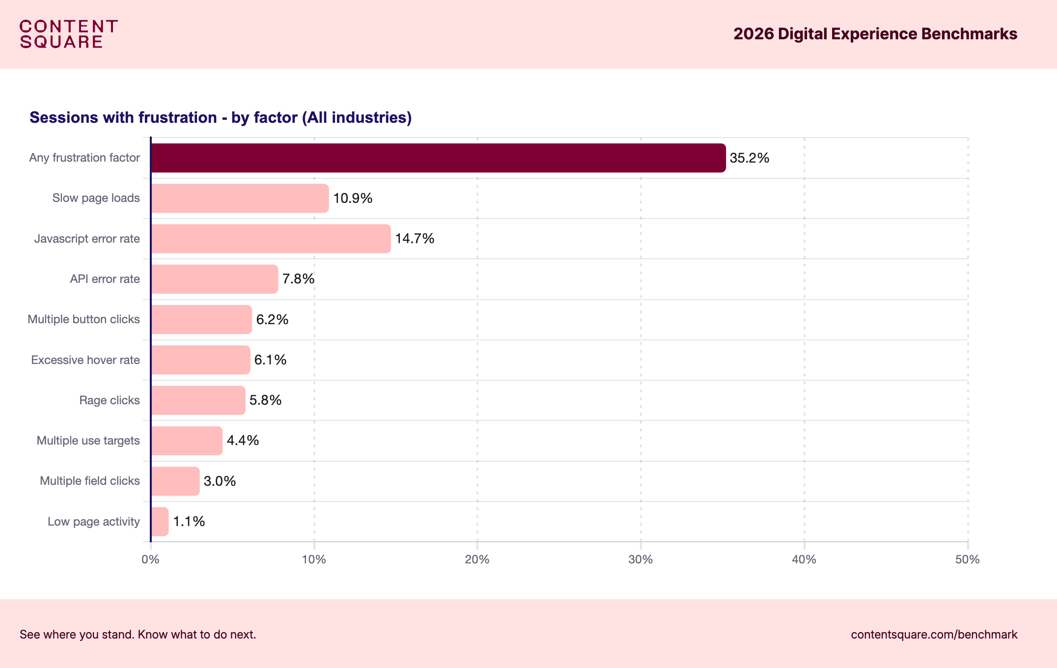
Long-term success depends on you catching problems at launch and then keeping the site accurate. Having a functional website is what helps drive most people who land there to make a purchase.
The website review process, step by step
Here's a practical process for reviewing a website from the first planning conversation through to fixes being actioned, whether you're doing it solo or coordinating a whole review team.
Use the steps below to build your website review project, to get consistent results that you have confidence in every time.
Step 1: Define the scope and goals
Decide upfront what's actually being reviewed. That might be the whole site, a single new section, or a redesign of one part of the business. Write down what "done" looks like, and who needs to sign off before it counts as finished.
At minimum, your review team should include a content owner, whoever owns the design, and someone who can action the fixes that come out of it. Skipping this step is how reviews drag on for weeks with no clear endpoint.
Make sure you also decide who has the final decision on different elements of the site, as what’s wrong and what’s right is not always clear.
Step 2: Test functionality and technical health
Work through every link, form, button, and interactive element to confirm it actually works. Test page load speed and check behavior across different screen sizes and browsers rather than just the one you happen to be using.
Google Analytics or a similar platform is worth checking before you even start clicking around. Pages with a high drop-off rate or an unusual traffic pattern often point you straight at the parts of the site that need the closest look.
Step 3: Review content and copy
Copy and content reviews can feel laborious, but are vital – which is why a good QA team and process is so important.
Read every page for plain typos and information that's gone out of date, and check that the tone still matches the rest of the site. High-quality content builds trust; a page with last year's pricing or a dead promotion undermines it.
Session recordings can help here too. Watching a video of where users actually pause, scroll past, or leave a page tells you which content is doing its job and which is just taking up space.
Step 4: Check design, UX, and mobile devices
Review visual consistency across pages and confirm the site actually behaves the way it's supposed to on mobile devices and different screen sizes, not just on the desktop you built it on.
It’s at this point where most first impressions form, since a growing share of visitors will never see your site on anything but a phone.
A Core Web Vitals report from Google can help here, as it tells you how quickly elements load on your site. If a visitor has to wait to even see your site, they’re even more likely to bounce out.
Check that buttons and forms are easy to use with a thumb, not just a mouse, and that nothing important gets cut off or hidden on a smaller screen.
Step 5: Collect and organize feedback from every reviewer
When website feedback arrives from different sources – by email, in a spreadsheet, or scattered across chat messages – half the context of earlier comments is gone by the time it reaches a developer, not to mention the risk of duplication.
Someone still has to manually turn "the button on the pricing page looks off" into an actual, actionable task.
You can solve this with a website annotation tool that collates all the reviews: every reviewer comments directly on the live page, and each comment is automatically stamped with a screenshot, technical data, the browser, and the screen size it was reported on, so a developer isn't left guessing what the report actually means.
A pile of scattered notes becomes a single, organized list the whole review team can see and act on.
Step 6: Prioritize and action the fixes
Once feedback is collected in one place, sort it by severity. A broken checkout flow is critical; a slightly misaligned icon is not. Assign each issue to whoever's fixing it, and set a rough timeline so nothing quietly sits untouched.
A review is only as useful as the fixes that come out of it. All the valuable insights in the world don't help if they never turn into next steps.
A pre-launch website review checklist
Use this checklist alongside the process above to make sure nothing gets missed before a site goes live:
Tools teams can use when reviewing a website
A handful of tool categories cover most of what a website reviewing process needs, and it's worth being clear about what each one actually does.
- Analytics tools like Google Analytics (which isn’t just a useful indicator of traffic sources) show you where some users drop off and where other users spend the least time, which is useful before you even start a manual review.
- Google Search Console is a good place to check the technical performance of your web pages.
- SEO tools like Ahrefs and Screaming Frog help confirm a site is set up to perform well in search results.
- For the review itself, a feedback tool like Marker.io enables every reviewer to comment directly on the live site, and the technical details a developer needs are attached automatically.
Marker.io helps you collect website feedback, and then organize, optimize, and action it during a review.
Our in-development website monitoring tool, which you can request early access to, offers an accessibility scanner and will soon include an SEO auditing tool so you can do a genuinely thorough review with one tool. Not to mention the fact that you get feedback from the whole team – developers, clients, stakeholders, and even users – in one place instead of a dozen separate ones.
How do you give feedback on a website design?
Useful feedback is specific. It names the exact page, the exact element, and what's wrong with it, rather than a general impression that leaves the next person guessing.
Compare "the homepage feels off" with "the hero button on the homepage doesn't stand out against the background image on mobile." The second version tells a designer exactly where to look and what to fix, without a single follow-up question.
Wherever possible, attach a screenshot or comment directly on the live page instead of describing it in writing. A visual reference removes most of the back-and-forth a text-only description creates, and it gets everyone to a confident decision faster.
An example of a website review task
A reviewer testing a product page on their phone notices the "Add to Cart" button doesn't visibly respond when tapped.
A poor piece of feedback reads: "Button seems broken on mobile."
A well-formed piece of feedback reads: "On the product page, the Add to Cart button shows no visible tap state on an iPhone in Safari. Expected: a hover or pressed style confirms the tap registered. Actual: nothing changes, so it's unclear whether the tap worked."
Attached is a screenshot showing the exact button, the page, and the device it was tested on.
The developer picking this up doesn't need to ask a single clarifying question, which is the entire point of good website reviewing: specific beats vague, every single time.
Conclusion
Reviewing a website well means covering content, design, functionality, and technical health together, not picking just one and calling it done.
It also means getting feedback from every reviewer into one organized place, rather than leaving it scattered across emails, spreadsheets, and chat threads where half the context gets lost.
If your team is ready to make that part easier, start a free trial of Marker.io and see how much faster a review moves when feedback arrives with the context your developers actually need, unlike when using most review sites.
How to review a website FAQs
What is an example of a good website review?
A good website review is specific and actionable: it names the exact page and element affected, describes what's expected versus what actually happens, and includes a screenshot or visual reference rather than a vague written description alone.
How long does a website review take?
It depends on the size of the site and how many reviewers are involved. A small site might take a day or two, while a larger site with several stakeholders and multiple rounds of feedback can take a couple of weeks from first pass to final fixes.
Who should be involved in a website review?
At minimum, include a content owner, whoever owns the design, and someone who can action fixes once feedback comes in. Larger reviews often add a QA-focused reviewer, user acceptance testing (UAT), and a stakeholder responsible for final sign-off.
Do you need special tools to review a website?
Not strictly, but they help. A spreadsheet or shared document can work for a very small site, but as soon as more than one or two reviewers are involved, a dedicated feedback tool saves significant time by keeping every comment and its context in one place.
What should I do now?
Here are three ways you can continue your journey towards delivering bug-free websites:
Check out Marker.io and its features in action.
Read Next-Gen QA: How Companies Can Save Up To $125,000 A Year by adopting better bug reporting and resolution practices (no e-mail required).
Follow us on LinkedIn, YouTube, and X (Twitter) for bite-sized insights on all things QA testing, software development, bug resolution, and more.
Gary Gaspar
Gary is Marker.io's CEO. He's passionate about startups, growth and business. Before Marker.io, he ran a web design agency. Outside of work, he's the biggest basketball fan!
Related blog posts



Get started now
Free 15-day trial • No credit card required • Cancel anytime