
Website Feedback: How to Collect It and Turn It Into Action
Learn what website feedback is, how to collect feedback on your website from visitors and your team, and how to turn it into real fixes.


TL;DR
- Website feedback is direct input from visitors, clients, and teammates, not just what analytics infers about behavior.
- Discover how you can start collecting customer feedback and valuable insights from visitors on your website, from surveys and widgets to visual, on-page comments.
- Learn how to ask for website feedback the right way, then turn what comes back into real fixes and conversion wins.
Introduction
Collecting website feedback is the fastest way to get qualitative data on what's actually happening on your site, instead of guessing from a bounce rate or a hunch in a Monday stand-up.
Every website generates two kinds of input, both qualitative and quantitative data:
- Analytics tell you what people did on the page, like the clicks and the scroll depth right before they left.
- Feedback tells you why they did it.
In this guide, you'll learn about the different types of website feedback, how to collect it from website visitors and from your own team, where and when to ask, and what to do with it once you have it so it actually changes something.
None of this requires a big process overhaul. Most of it comes down to asking the right question, in the right place, and giving someone the job of actually reading what comes back.
What is website feedback?
Website feedback is direct input collected from the people who use, review, or help build a website. That covers a visitor sharing what they think of a page, a client marking up a design before it goes live, or a teammate flagging a bug during testing.
It is different from analytical data, such as a heatmap or a session recording, which shows you what happened on a page. Analytics can't tell you that a visitor abandoned checkout because the shipping cost only appeared at the last step, or that a client thinks a button looks out of place. Feedback fills in that gap, and there are a number of website design feedback tools to choose from.
Once you have the feedback, then you can make the fixes. Across its checkout usability testing, Baymard Institute found that the average large-scale e-commerce site can lift its conversion rate by 35% simply by fixing the usability issues its research uncovers, many of which are the same kind of friction visitors and reviewers flag directly.
Website feedback also isn't the same thing as a review or a testimonial. A review is written after the fact, usually for someone else's benefit, and rarely points at a specific page or element. Website feedback is aimed at you, tied to a specific moment on the site, and exists to be acted on rather than published.
The two types of website feedback
These are the main types of website feedback you are likely to receive:
- Feedback from your visitors – Ratings, NPS scores, open-ended survey answers, and exit-intent responses that tell you how people experience your site and what's stopping them from converting.
- Feedback from your team, clients, and testers – Bug reports, design sign-off comments, and usability notes gathered before or after launch, usually from people with a direct stake in the site rather than anonymous visitors.
The one you need depends on the goal. Trying to understand visitor sentiment or cut checkout drop-off calls? Get visitor feedback. Catching a layout bug before a client sees it live, or getting a stakeholder to approve a redesign? Go for team, stakeholder, or tester feedback.
How to collect feedback on your website
Once you know which kind of feedback you're after, the next question is how to collect feedback on your website without negatively affecting the experience of your potential buyers. Here are some feedback processes you can use:
- On-page and pop-up surveys – Short surveys that appear directly on a page, either as a small slide-in prompt or a full pop-up. Good for visitor sentiment, but overusing pop-ups annoys people and drags response rates down fast.
- Feedback buttons and website feedback widgets – A small, persistent button that lets a visitor share a comment whenever something bothers them, rather than only when you happen to ask. Useful for catching problems you wouldn't have thought to survey about.
- Exit-intent forms – Triggered the moment someone's about to leave a page, these feedback forms catch one of the few windows where you can ask why without interrupting a task in progress.
- Visual, on-page feedback for your team and clients – Instead of a written description, a reviewer clicks directly on the page and leaves a comment pinned to that exact spot. This is the standard approach for design feedback and pre-launch QA, where precision matters more than reach.
- Live chat – A direct line to whoever's on your site right now, useful for early-stage sites that don't have much traffic to run a statistically meaningful survey against yet.
- Community and paid testers – If your site isn't live yet, or doesn't have traffic, ask people to test it directly and record their reactions. It's a practical option long before real visitor volume shows up.
Every one of these feedback methods has positives and negatives. Micro surveys and widgets are close to effortless for the person answering, but they cap out at whatever the question format allows them to say. Visual feedback captures far more context per comment, but it depends on people who are already invested enough in the site to sit down and review it, so it isn't built for anonymous visitor sentiment at scale.
Most sites end up running more than one of these at once. A survey on your pricing page and a feedback widget or button on your app's dashboard solve different problems, so there's no need to force one tool to cover both.
How to ask for website feedback the right way
How you ask determines whether you get anything useful back. A few rules hold up across every method above.
- Keep it short and specific – One question about one thing beats five questions bundled into a single form. "What almost stopped you from checking out?" gets a sharper answer than "How was your experience?"
- Time it to the moment – Ask right after the relevant action, not on page load. A satisfaction question has more impact right after checkout than it does the second someone lands on your homepage.
- Explain why you're asking – A single line explaining what you're trying to fix makes people more likely to answer honestly instead of skipping past.
- Target the right page and audience – A question about pricing belongs on the pricing page, not buried in a general site-wide survey that most visitors will never see.
Get these right, and you'll spend far less time chasing feedback and more time acting on it.
Where and when to collect website feedback
Where you ask matters as much as how. A handful of pages consistently produce the most useful website feedback.
You don't need feedback on every page. Start with the one or two pages where you already suspect a problem, and let the answers tell you where to look next.
What device the person giving feedback is using also has an impact. A checkout flow that feels fine on desktop can fall apart on a small screen, so if a meaningful share of your traffic is mobile, make sure whatever you're using to collect feedback actually renders and works well there, rather than assuming a desktop-tested prompt behaves the same way on a phone.
Layering too many prompts onto the same page creates fatigue fast, and fatigued visitors either ignore every prompt or close the first one they see out of habit. If a pricing page already carries an on-page survey, don't put a feedback widget asking about the same thing there as well. Pick one method per page and give it room to work.
How can I collect actionable website feedback from visitors?
Not all website feedback is equally valuable.
"The page feels confusing" doesn't tell you where to start looking. "This 'Subscribe' button looks like the checkout button" does. The difference between vague and actionable feedback usually comes down to three things.
- Specificity: What exactly the problem is, not just that one exists.
- Location: Which page, which element, which step in the process.
- Context: What the person was trying to do when it went wrong.
Getting specificity and location right is largely dependent on design. An open-ended text box tends to get vague answers back. A prompt tied to a specific element, or a comment pinned directly onto the page, gets specific ones as it provides the visitor with context.
Context is also where technical detail comes in.
If you know a reporter's browser, device, screen size, and what was happening in the console at the time, the report you get is something a developer can act on immediately, instead of a back-and-forth trying to reproduce it.
A plain comment box can't give you that detail, so if you’re looking for a tool built specifically for visual feedback capture, make sure it also captures that technical context automatically alongside the comment itself.
Picture two reports describing the same bug. One just reads: "checkout is broken." The other pins a comment to the exact button, on the exact page, with the browser and screen size attached. The second report gets fixed the same day, while the first could sit in a queue until someone is able to reproduce it.
If you want actionable, qualitative feedback, design the collection method to capture the where and the what automatically, rather than relying on the person reporting it to describe both accurately in their own words.
This critical feedback data is as important for clients and teammates as it is for visitors. A stakeholder reviewing a staging site rarely thinks to note their browser or screen size, so the collection method needs to capture that detail for them rather than expecting them to remember.
How to use website feedback to increase conversions
Feedback earns its keep when it turns into a conversion fix, not just a report nobody reads. The loop looks the same regardless of the page.
- Collect feedback at the friction point – Put the question where the problem actually happens: checkout, pricing, login, or wherever a funnel report shows people dropping off.
- Look for the repeated reason, not the loudest one – One detailed complaint might be a one-off. The same complaint from a dozen different visitors is a pattern worth acting on.
- Make one specific change – Fix the thing the feedback actually pointed to, rather than a broader redesign based on a hunch.
- Re-measure – Check whether the change moved the number it was meant to move, then ask again.
Here is a common example: an exit-intent prompt on a checkout page turns up the same answer from several visitors. Shipping costs only appear at the final step, and it feels like a surprise. That's a specific, fixable problem. Show shipping costs earlier in the flow, then watch whether checkout abandonment drops.
The same loop works on a pricing page. If feedback keeps surfacing confusion about what's included in a plan, fix the plan copy rather than reaching for a new hero image.
Small, feedback-led changes tend to beat large redesigns built on assumptions. They solve a problem someone actually described, not one the team guessed at.
Analytics can tell you how many visitors abandon a page at a specific step. It can't tell you why. Feedback fills in the why, which is the part you need to know before you change anything. Jumping straight to a redesign based on a bounce rate alone is how you end up fixing the wrong thing.
How do I analyze qualitative website feedback efficiently?
Open-ended feedback is the most useful kind and the hardest to process at volume. A handful of habits can help to keep it manageable.
- Tag by theme and page: Sort responses into a small set of categories tied to where they came from – pricing, navigation, checkout, design – rather than trying to read every comment fresh each time.
- Weigh frequency over detail: A short comment that ten people wrote independently usually shows a clearer issue than one long, articulate comment from a single visitor. Look for the pattern before chasing the outlier.
- Separate edge cases from real patterns: Not every comment deserves a fix. A one-off complaint from someone on an unsupported browser is worth noting, not necessarily acting on right away.
At any real volume, doing this by hand is a slow process. AI-assisted summarization and categorization tools provide a practical way to group hundreds of open-ended responses into themes in minutes instead of hours, surfacing the patterns worth a closer look without requiring someone to read every single line.
Once you've identified something worth fixing, route it straight into whatever tool your team already tracks work in, whether that's a project management board or an issue tracker.
Feedback that gets read by five people but acted on by none of them is functionally the same as feedback nobody collected at all. A short, regular review, weekly for a busy site and monthly for a quieter one, prevents your qualitative data from becoming something nobody reads.
What is the most effective website feedback survey?
There's no single best website survey. The most effective one is whichever type matches what you're actually trying to measure. Here are the three most common formats:
- Net Promoter Score (NPS) asks how likely someone is to recommend you, on a 0–10 scale. Best for tracking loyalty over time, not for diagnosing a specific page problem. Example question: "How likely are you to recommend us to a friend or colleague?"
- Customer Satisfaction Score (CSAT) measures satisfaction with one specific interaction, asked right after it happens, usually part of the website visitor or customer experience. Example question: "How satisfied were you with your checkout experience today?"
- Customer Effort Score (CES) measures how much effort something took, which correlates closely with whether someone comes back. Example question: "How easy was it to find what you needed today?"
Match the format to the goal. NPS suits tracking sentiment across quarters. CSAT suits a specific moment like checkout or a support interaction. CES suits anything where friction, not sentiment, is the real concern, like navigation or a signup flow.
Format is as relevant as question type. In a 2025 analysis of over 4,300 surveys, Survicate found that surveys with two to three questions had the highest median response rate, at 15.97%, ahead of single-question surveys and well ahead of surveys with seven or more questions, which dropped to a 6.87% median.
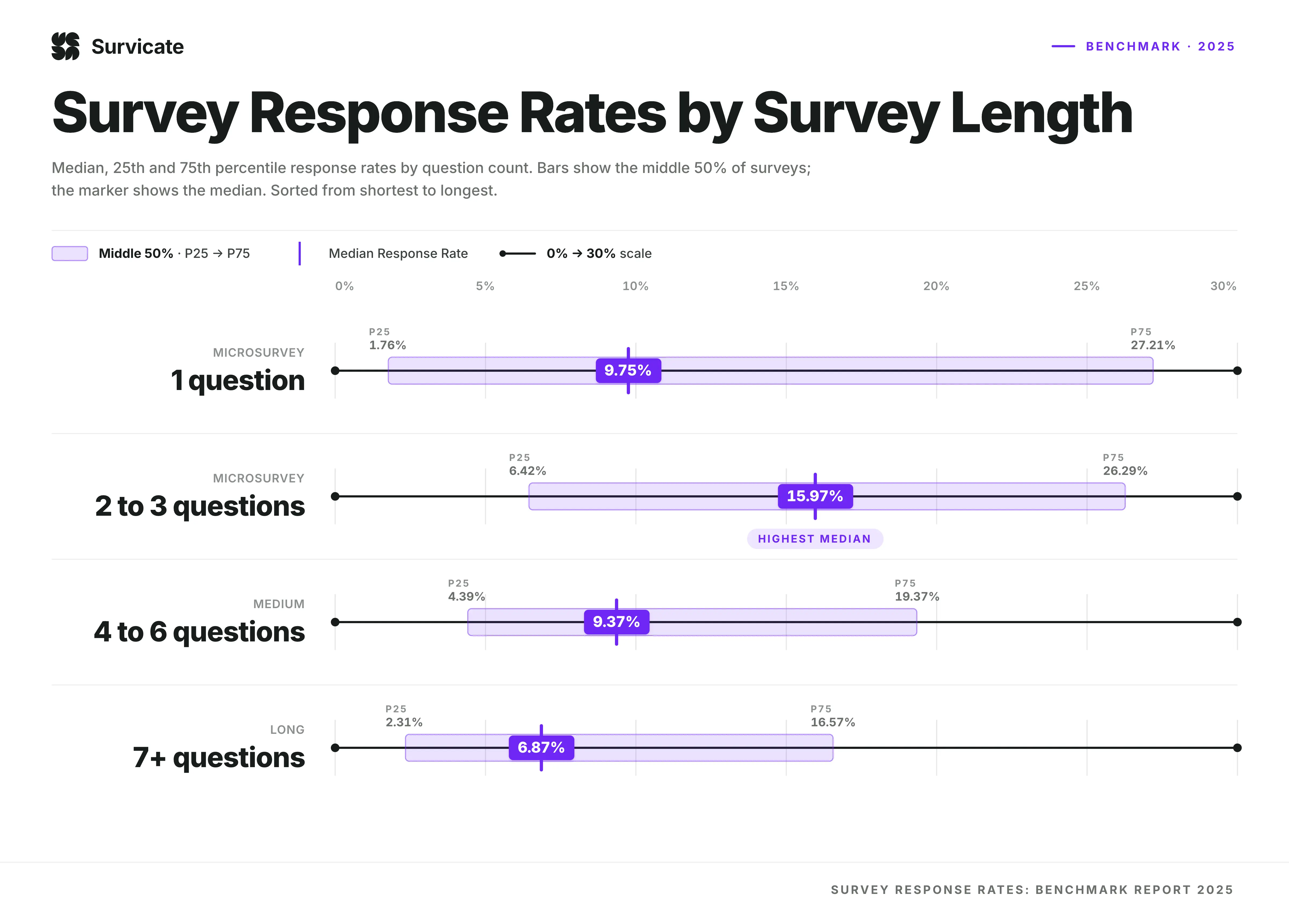
As a rule, one to three questions is the ceiling before response rates start dropping off. Every extra question after that reduces the depth of answer you are likely to get, and most teams are better served by reach.
None of this applies if what you actually need is a bug report or a design opinion rather than a sentiment score. A five-point scale can tell you a page feels difficult to use. It can't tell you that the "Subscribe" button looks identical to the "Checkout" button.
For that kind of specific, visual issue, a survey is the wrong tool to use, while a comment pinned directly to the page using a widget or Chrome extension will get you further, faster.
Conclusion
Website feedback only creates value once it's specific, well-timed, and routed somewhere it actually gets acted on. Get those three things right, and it becomes one of the most direct ways to understand what's working on your site and what isn't.
Visitor feedback and team feedback solve different problems, and most sites need both: surveys and widgets to understand sentiment and friction, plus a more visual, contextual approach for the bugs, design issues, and sign-offs your own team and clients need to flag before or after launch.
If you’re struggling to understand issues visitors encounter on your site, start a free trial of Marker.io to see how pinning website feedback tools directly to the page, with the technical context a developer needs already attached, turns website feedback from a scattered inbox into something your team can actually act on.
Website feedback FAQs
How often should you collect website feedback?
There's no fixed cadence. It depends on your traffic and how much is currently changing on the site. A high-traffic page benefits from an always-on feedback widget, while a lower-traffic page might only need a survey around a specific launch or redesign. The bigger risk usually comes from stacking too many prompts onto the same page at once, not from asking too rarely.
Is website feedback the same as user feedback?
They overlap, but they're not identical. Collecting user feedback, also sometimes referred to as customer feedback, usually involves getting input about a product or app experience, often from logged-in users. Website feedback covers a broader set of sources, from anonymous visitors to clients reviewing a design, and it applies to marketing sites and landing pages just as much as to logged-in product experiences.
What's the difference between a website feedback survey and a feedback widget?
A survey asks a specific question at a specific moment and gives you structured, comparable answers. A feedback widget is a visual feedback tool that sits on the page all the time and lets a visitor raise something whenever it occurs to them, with no set question to answer. Surveys are better for measuring something over time, while widgets are better for catching problems you didn't know to ask about.
What should I do now?
Here are three ways you can continue your journey towards delivering bug-free websites:
Check out Marker.io and its features in action.
Read Next-Gen QA: How Companies Can Save Up To $125,000 A Year by adopting better bug reporting and resolution practices (no e-mail required).
Follow us on LinkedIn, YouTube, and X (Twitter) for bite-sized insights on all things QA testing, software development, bug resolution, and more.
Related blog posts


Get started now
Free 15-day trial • No credit card required • Cancel anytime