
How to Test Your Website on iPhone Duo: A Practical Guide for Web Teams
iPhone Duo gives your website three screen widths and a fold in the middle. Here's how to test your site for it before the device ships on 23 October.


How to Test Your Website on iPhone Duo: A Practical Guide for Web Teams
Testing a website on iPhone Duo means checking that your site works on the outer screen, on the inner screen, and during the moment a visitor opens or closes the phone. That last part is new. Every previous iPhone gave you one viewport that only changed on rotation. Duo gives you a viewport that changes without rotation, in the middle of a session, whenever the user feels like it.
Apple announced the device on 9 September. Pre-orders open on 16 October and it reaches customers on 23 October. That leaves web teams about five weeks to find out what breaks, and most of that time will be spent without a physical device.
In this guide, you'll learn what actually changes for websites, how to test for it now, and what to report back to your developers so the fixes land before your customers notice.
What is iPhone Duo?
iPhone Duo is a book-style foldable. Closed, it's a normal-looking iPhone with a 5.4-inch outer display. Open, it becomes a 7.6-inch tablet-sized screen with a fold down the middle. Apple says both displays share the same aspect ratio, so content moves between them without changing shape.

It runs iOS 27. Two things in iOS 27 are important for websites:
- Split View. For the first time on an iPhone, two apps can sit side by side on the inner screen. You can also open two Safari windows next to each other.
- Size classes. To an app, the inner screen reports itself as "regular" in both dimensions, the same class that an iPad uses. The outer screen behaves like any other iPhone.
That second point is the one to remember. When the phone is open, iOS treats it as a small tablet. It's reasonable to expect Safari to follow that lead, but Apple hasn't published how Safari behaves on Duo yet, so treat everything about the browser as unconfirmed until the simulator or the device arrives.
What changes for your website
Three things, in order of how likely they are to impact you.
1. You now have three widths to support
The pixel figures come from Apple's spec sheet. The CSS viewport values are estimates from third-party device databases, calculated at a 3x pixel ratio, and haven't been confirmed by Apple. Expect the real dimensions to be a few points off.
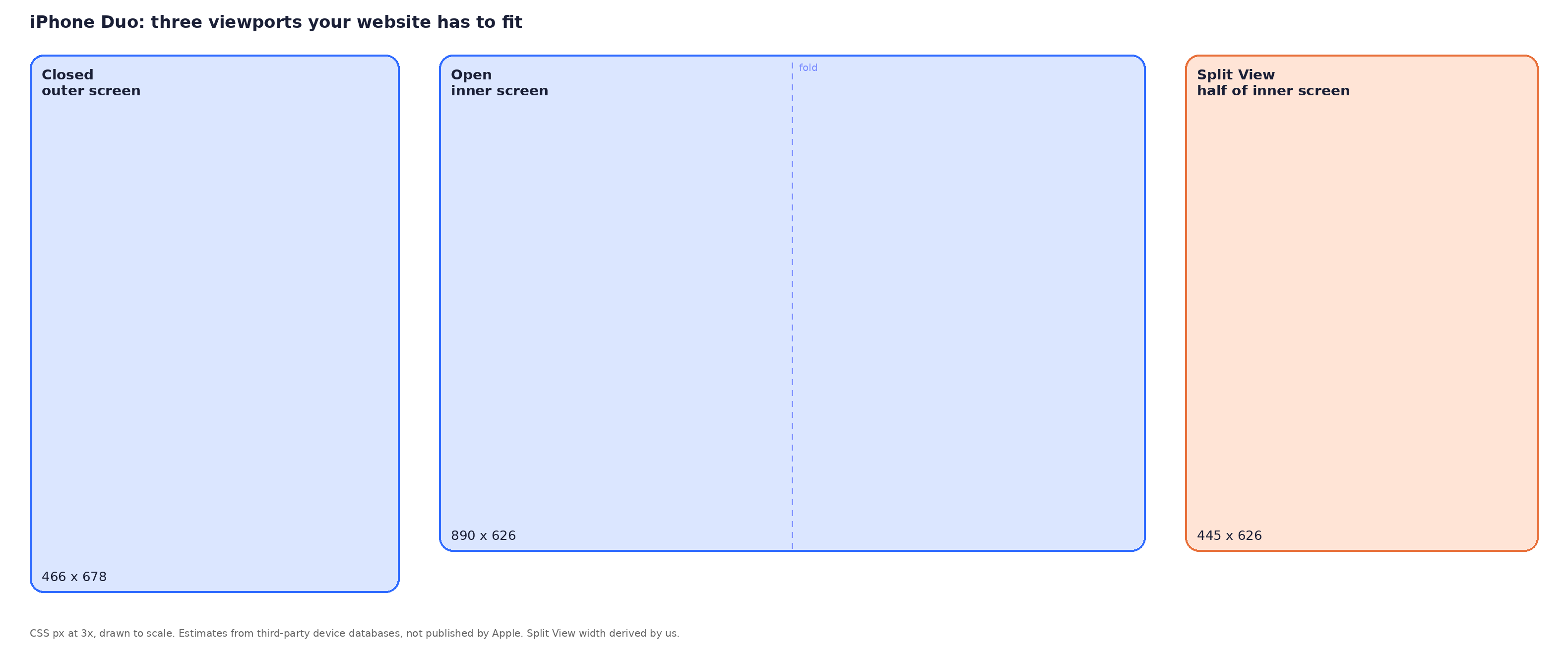
Two of these widths are unusual in modern phones. The closed screen is squarer than any iPhone since the SE, so tall hero sections and full-height modals lose more of the page than you're used to. The open screen lands at roughly 890 pixels wide, which sits right between the tablet and desktop breakpoints in most CSS frameworks. If your layout has a gap there, Duo will find it.
Split View is the surprise. With two Safari windows on the open screen, each site gets about 445 pixels, narrower than the closed phone, so the "big screen" mode can actually produce the smallest viewport of the three.
2. The viewport changes mid-session
On a normal phone, your layout code only has to react to rotation. On Duo, the visitor can open the phone while reading your pricing page, and the viewport jumps from roughly 466 to 890 pixels wide without any orientation change.
Sites that read window.innerWidth once on load and store it will keep the closed-phone layout on the open screen. Sliders, charts, maps, and anything that calculates its own dimensions in JavaScript are the usual suspects. Pure CSS media queries and container queries handle the change on their own.
3. Safari has no fold API
Chrome and Samsung Internet support two web standards for foldables:
- The Viewport Segments API, which tells a page where the hinge is.
- The Device Posture API, which tells it whether the device is folded.
WebKit hasn't adopted either, and its standards-position issues for Viewport Segments and Device Posture are still open.
In practice, your website can't detect the fold on Duo. It can only see a viewport of a certain size. That's fine, as long as you don't build anything that depends on knowing where the hinge is. Assume the crease can sit anywhere under your content and design.
How to test your website on iPhone Duo
You'll go through four stages between now and launch. The first two need nothing more than a desktop browser.
Step 1: Test at the three widths in browser DevTools
Open Chrome, Firefox or Safari DevTools, switch to responsive mode, and add three custom presets:
- Duo closed: 466 x 678
- Duo open: 890 x 626
- Duo Split View: 445 x 626
Set the device pixel ratio to 3 and the user agent to iPhone, then walk through your key pages at each size: home, the top landing pages, pricing, checkout or sign-up, and any page with a form.
What you're looking for at each width:
- Navigation that collapses correctly and stays reachable
- No horizontal scroll
- Images and video that don't overflow or letterbox badly
- Text that's readable without zooming at 466 wide and doesn't stretch into 150-character lines at 890 wide
- Modals, cookie banners and chat widgets that fit inside the shorter closed screen
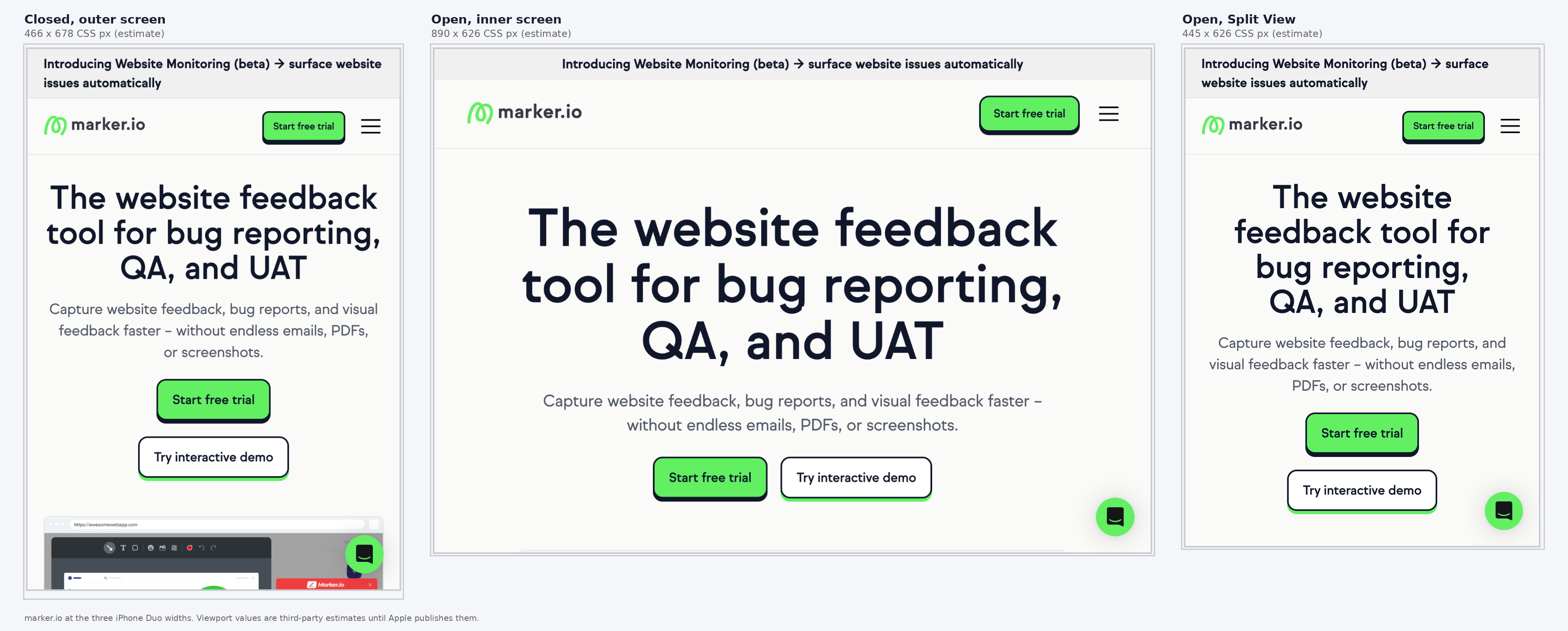
These values are estimates, so don't tune breakpoints to the exact pixel. Make sure nothing breaks in the 440 to 900 range as a whole.
Step 2: Test the transition
Now drag the responsive-mode handle from 466 to 890 wide and back, slowly, on each page. Don't reload between sizes. This simulates opening and closing the phone mid-session.
Watch for:
- Layouts that only update after a refresh
- Carousels and sliders that keep their old slide width
- Charts, maps and embeds that stay at the old size
- Sticky headers and footers that stack and eat the shorter screen
- Menus left open in the wrong state after the switch
If something only fixes itself on reload, the code is caching the viewport size. That's a small fix, but it's the single most common foldable bug.
Step 3: Test in the iPhone Duo simulator
Apple has said Xcode 27.1, due later in September, includes an iPhone Duo simulator with controls to open, close and rotate the device. Once it's out, this is the first place you'll see Safari's real viewport size, user agent, and behaviour on fold.
When it lands:
- Open your site in the simulator's Safari and record the actual
innerWidthandinnerHeightin both postures - Update your DevTools presets from Step 1 with the real values
- Repeat the transition test using the simulator's fold control
- Check whether Safari on the open screen requests the desktop version of your site, as iPadOS does. If it does, your tablet layout will get more traffic than you expect
The simulator won't tell you about performance or touch, but it will settle every question about layout.
Step 4: Test on a real device from 23 October
Some things only show up on hardware:
- Touch targets across the crease. A button that sits on the fold is hard to press. Check your primary CTAs on the open screen.
- Safe areas. Apple says the inner display's safe areas are asymmetric. Content pinned to the edges may sit behind the Dynamic Island or the hinge.
- Split View. Put your site next to another app and confirm it's usable at half width.
- Orientation. Rotate in both postures. The inner display ignores app orientation locks, so don't assume portrait.
- Speed. Open and close the phone on a heavy page and see how long the layout takes to settle.
You don't need to buy a $1,999 phone for every tester. One device shared by the team, or a cloud device farm once they add it, will cover most of this. BrowserStack's foldable device list and similar services hadn't added Duo at the time of writing, so check before you plan around them.
Step 5: Report what you find with full context
Foldable bugs are hard to reproduce because the reproduction depends on posture. "The pricing table overlaps on iPhone Duo" isn't enough. Your developer needs to know: closed or open, portrait or landscape, Split View or full screen, what the viewport was, and what the page looked like at that moment.
This is where a bug reporting tool like Marker.io earns its place. Testers report from the page itself, on the device, and the report arrives with a screenshot, the page URL, browser and OS versions, screen size, console logs, and network requests attached automatically.
Session replay shows the seconds before the report, which, for a foldable bug, usually includes the fold itself. The ticket lands in Jira, Linear, ClickUp, or whichever tool your developers already use.
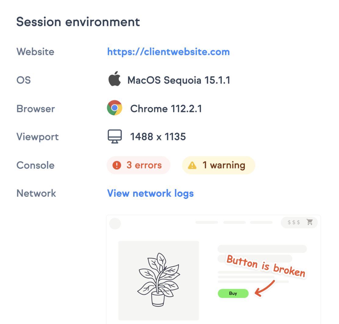
Bear in mind that no reporting tool knows the device's posture today because Safari doesn't expose it. Ask testers to write "open" or "closed" in the first line of every report until that changes.
iPhone Duo website readiness checklist
Run this against your top ten pages. Every item should be true at all three widths. If you already use our website QA checklist, add these to it.
Layout
- No horizontal scrolling at 466, 890 or 445 wide
- Nothing important sits in the middle 40 pixels of the open screen, where the crease falls
- Breakpoints don't leave a broken layout anywhere between 440 and 900 pixels
- Grids reflow from one column to two or three without orphaned items
Navigation
- Menu is reachable at every width, including Split View
- Menu closes cleanly when the viewport changes
- Sticky elements never take more than a quarter of the closed screen's height
Overlays
- Cookie banners, modals and chat widgets fit inside 678 pixels of height with the close button visible
- No overlay spans the crease on the open screen
Media
- Images and video scale with the container, not the viewport
- Embeds (like maps, players, and calculators) resize on viewport change without reload
Forms and checkout
- Every form completes on the closed screen with the keyboard open
- Checkout works in Split View next to a password manager or notes app
Code
- No JavaScript stores the viewport size on load
- Layout responds to
resizeor container size, not to orientation events alone - Nothing depends on detecting the fold
Common mistakes with foldable websites
- Tuning to the exact pixel. The viewport values above are estimates and will change once Safari's toolbar is in the picture. Test ranges, not points.
- Treating the open screen as a desktop. At 890 wide, it's a small tablet. Desktop layouts with three columns and hover-only menus will feel cramped and won't work by touch.
- Forgetting Split View. Teams test closed and open, then ship. Half of the open screen is narrower than the closed phone, and it's the mode people will use while shopping or comparing.
- Testing screenshots instead of transitions. A layout can look perfect in both postures and still break in the moment between them. Drag the handle.
- Waiting for the device. By the time you can hold one, your customers can too. Steps 1 and 2 need nothing you don't already have.
Conclusion
iPhone Duo doesn't need a new design. It needs a layout that holds up at three widths, survives a viewport change without a reload, and never assumes it knows where the fold is.
Most sites built on modern responsive CSS will get most of the way there. To make sure yours does, test the transition and report what breaks with enough context that it can be fixed.
If your team is about to run a round of Duo testing, try Marker.io for free and let testers report the issues with the technical context attached.
iPhone Duo website testing FAQs
What screen size does iPhone Duo have for websites?
Apple lists the outer display at 5.4 inches (1398 x 2034 pixels) and the inner display at 7.6 inches (1878 x 2670 pixels). Apple hasn't published CSS viewport values. Third-party estimates put them at roughly 466 x 678 closed and 890 x 626 open, at a 3x pixel ratio. Confirm them in the Xcode 27.1 simulator once it ships.
Do I need to redesign my website for iPhone Duo?
Almost certainly not. If your site is responsive and doesn't cache the viewport size in JavaScript, it will adapt. Test the three widths and the transition between them, then fix what breaks.
Can a website detect whether iPhone Duo is folded?
Not today. Safari doesn't support the Viewport Segments or Device Posture APIs that Chrome and Samsung Internet use. Your site only sees a viewport of a given size. Design so the fold's position doesn't matter.
How do I test on iPhone Duo without owning one?
Use custom presets in browser DevTools for the three widths, test the resize transition by dragging, and then use the iPhone Duo simulator in Xcode 27.1 when Apple releases it. Real-device testing starts on 23 October.
What should I do now?
Here are three ways you can continue your journey towards delivering bug-free websites:
Check out Marker.io and its features in action.
Read Next-Gen QA: How Companies Can Save Up To $125,000 A Year by adopting better bug reporting and resolution practices (no e-mail required).
Follow us on LinkedIn, YouTube, and X (Twitter) for bite-sized insights on all things QA testing, software development, bug resolution, and more.
Related blog posts



Get started now
Free 15-day trial • No credit card required • Cancel anytime