15 Web Accessibility Examples to Inspire Your Website
15 web accessibility examples from leading brands. WCAG tips for screen readers and keyboard navigation, plus how Marker.io helps capture and fix issues.


If you’ve ever tried to retrofit accessibility onto an existing site, you already know the pain: the quick fixes (add alt text, tweak color contrast) are easy to spot, but the real blockers often live in the user interface details—focus states hidden behind sticky headers, dropdown navigation menus that trap keyboard users, form field labels that screen readers can’t interpret, or scrolling content that’s impossible to navigate without a mouse.
This article is a curated set of web accessibility examples from recognisable organisations, with real-world a11y case studies from global brands and public-sector teams, so you can see what “good” looks like across different industries.
Web accessibility is about equal access for people with disabilities using assistive technology – like screen readers, switch devices, voice control, zoom tools, and plain old keyboard navigation with the Tab key. The benchmark most teams map to is the Web Content Accessibility Guidelines (WCAG) from W3C. WCAG 2.2 adds extra emphasis on things like visible focus and making sure focus isn’t obscured.
There are also legal requirements in many regions, such as the DOJ’s ADA guidance in the United States. Check out our ADA compliance checklist to improve your site’s compliance.
Web accessibility examples for e-commerce sites
E-commerce is where accessibility either pays off immediately, or breaks the whole journey. Product discovery relies on navigation menus, filters, and complex images, while checkout relies on form fields, error messages, and clear instructions. If any of those key elements fail keyboard access or confuse screen reader users, you lose customers – and what’s worse, you usually won’t see this in your conversion dashboard.
The best web accessibility examples for e-commerce sites tend to share a few traits:
- Predictable heading structure and page title patterns, so assistive tech users can orient fast
- Strong keyboard focus styling, so users always know where they are
- Sensible link text and button labels, so users aren’t guessing
- Solid baseline hygiene, such as alt text, label/inputs, color contrast, ARIA tags where needed
Here are 15 examples of websites with good e-commerce accessibility.
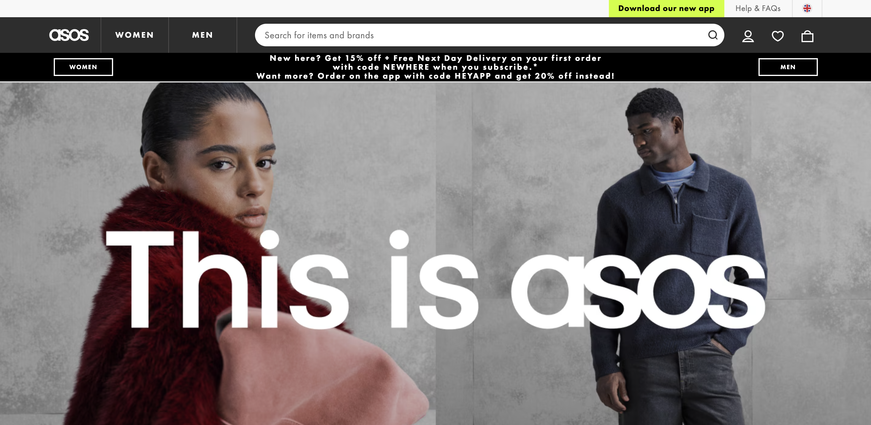
Asos
ASOS is a major online fashion retailer, selling clothing, shoes, accessories, and beauty products globally.
Fashion sites are typically heavy on imagery, promotional components, and dynamic filtering. On the other hand, ASOS focuses on providing a clear layout and easily readable text, while still satisfying the consumer’s need for imagery.
Use the site as inspiration for:
- Image-heavy pages that still work for screen readers – Product grids and promo tiles are where missing/weak alt text usually explodes.
- Keyboard-first browsing – Filter drawers, size selectors, and quick-add patterns should be usable with tab/shift+tab and have obvious keyboard focus.
- Selected states that are clear – When a filter, chip, or toggle is “on,” it needs to be visually distinct and announced correctly to assistive technology.
If you’re designing a similar UI, test a typical path (category → filter → product page → add to bag) without a mouse, and you’ll quickly find any accessibility barriers.
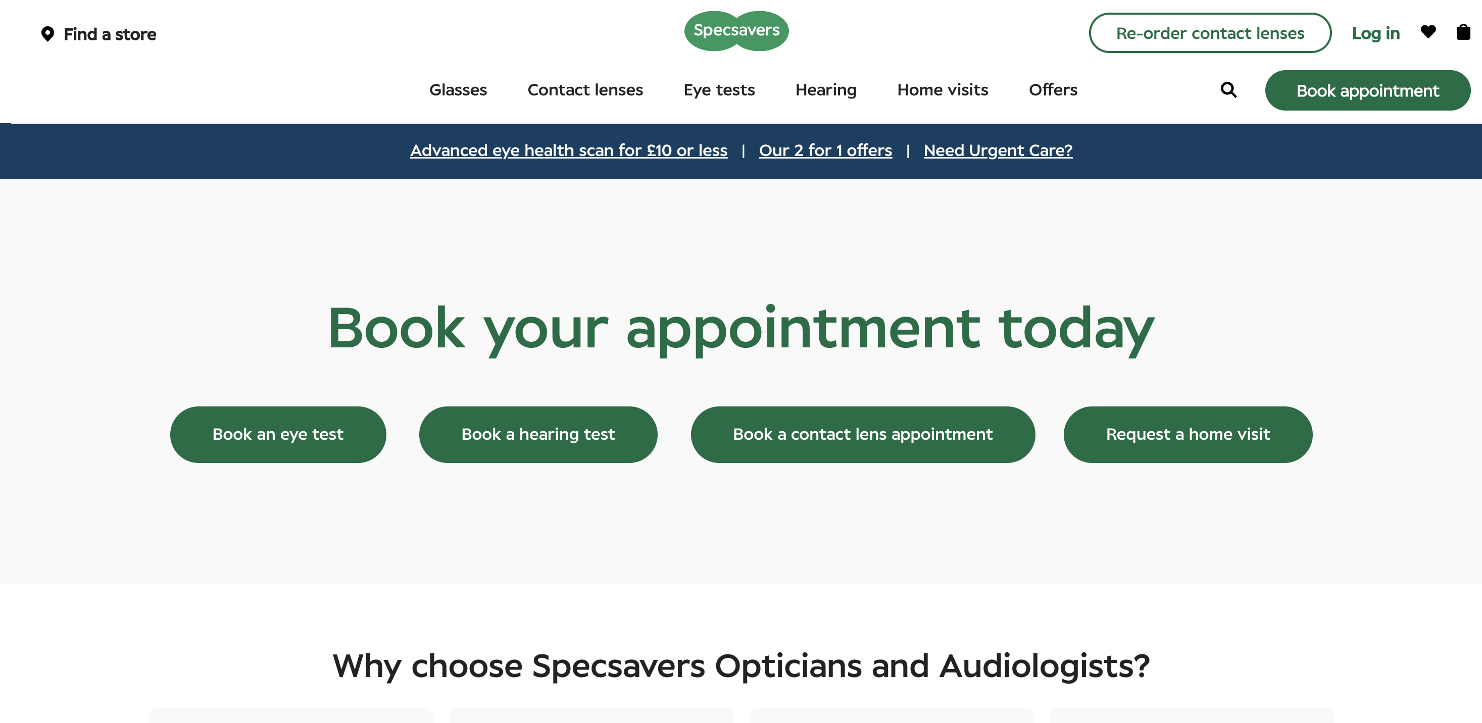
Specsavers
Specsavers is a well-known optical and hearing services retailer, offering eye tests, glasses/contacts, and hearing care through physical locations and online journeys.
Unsurprisingly, the company is conscious that many visitors to their website might be vision-impaired, which is reflected in their commitment to accessibility.
Specsavers’ website is a useful reference point for service-led e-commerce – the kind where users book appointments, find a store, and complete multi-step tasks (not just “add to cart”).
Use the site as inspiration for:
- Task flows that stay usable on keyboard – Booking and location journeys often introduce modals, sticky elements, and validation steps that can break keyboard focus.
- Clear, descriptive labels – Service forms tend to have more fields and more “edge cases” (dates, times, eligibility, location pickers).
- Navigation that’s easy to recover from – People with a broken arm, tremor, or just a trackpad on a train rely on consistent keyboard access and predictable focus order.
Don’t aim for perfect if you’re developing your own e-commerce site; aim for an experience with no dead ends, so users can always find the service or solution they need.
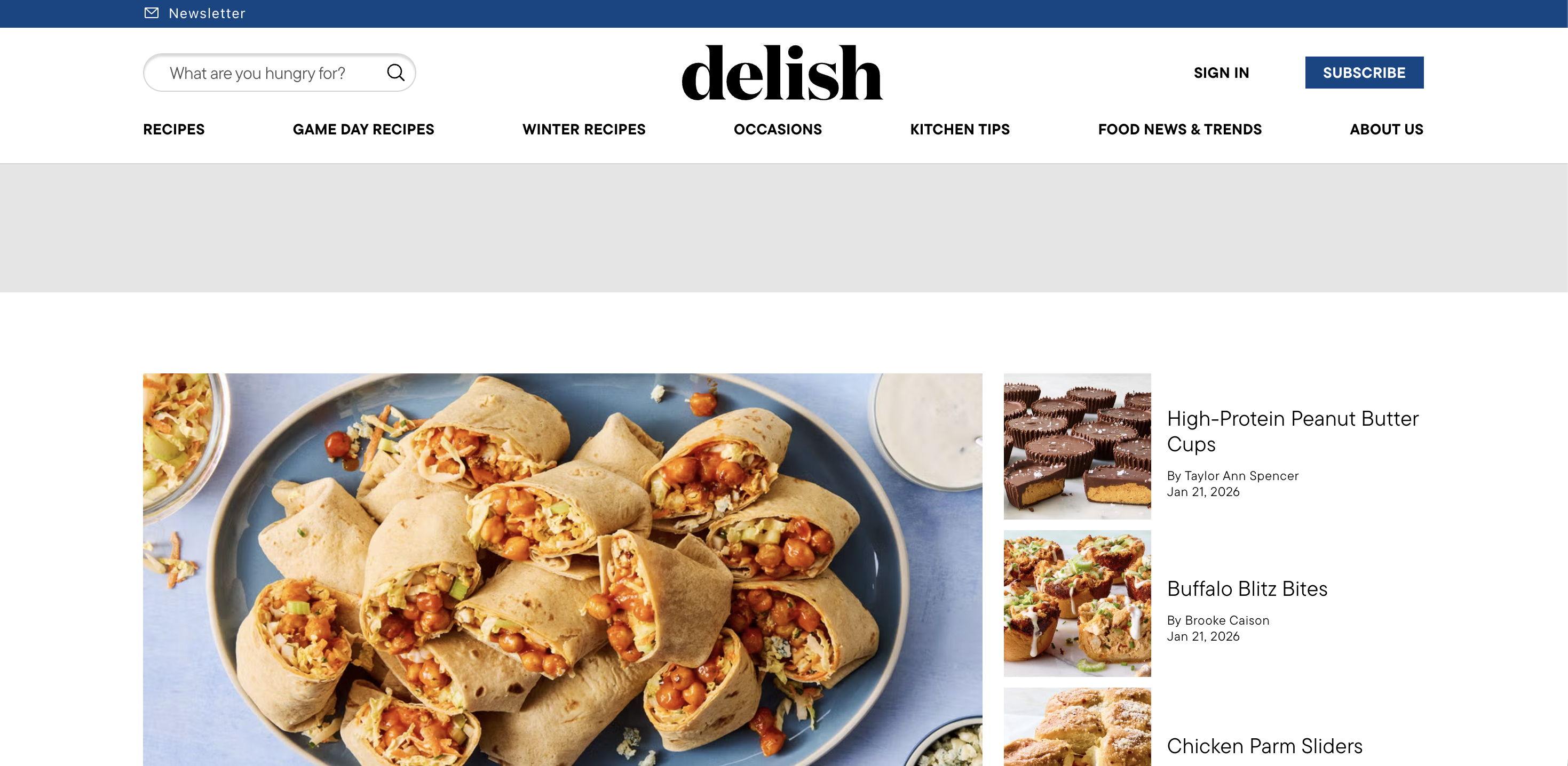
Delish
Delish is a food and recipe publisher – think cooking inspiration, meal plans, and evergreen recipe content – built around high-traffic browsing experiences.
Delish is a helpful example of content-first commerce experiences, where monetization and conversion happen through a mix of content, CTAs, and shopping and affiliate patterns.
If your site blends editorial with conversion, look for:
- Readable layouts with low cognitive load – Strong hierarchy, scannable sections, and obvious major sections help users with cognitive disabilities.
- Accessible multimedia content – Recipe pages often embed video, so captions and clear controls matter.
- Link clarity in dense pages – Avoid “read more” hyperlinks – screen reader users often navigate by links alone, so link text should carry context.
Web accessibility examples for education sites
Education sites are deceptively hard to make accessible, but when so many people need access, it’s vitally important.
They’re huge, they have legacy pages, and they’re packed with PDFs, complex images – such as maps and diagrams – and time-sensitive forms. They also serve one of the broadest audiences imaginable: prospective students, current students, parents, researchers, and staff, which includes any users with visual impairments, cognitive impairments, and users on different devices.
The strongest website accessibility patterns in education usually include:
- A consistent page title and heading structure
- Accessible documents, or at least a plan to fix PDFs
- Video with captions and transcripts
- Reliable keyboard navigation across mega-menus and search
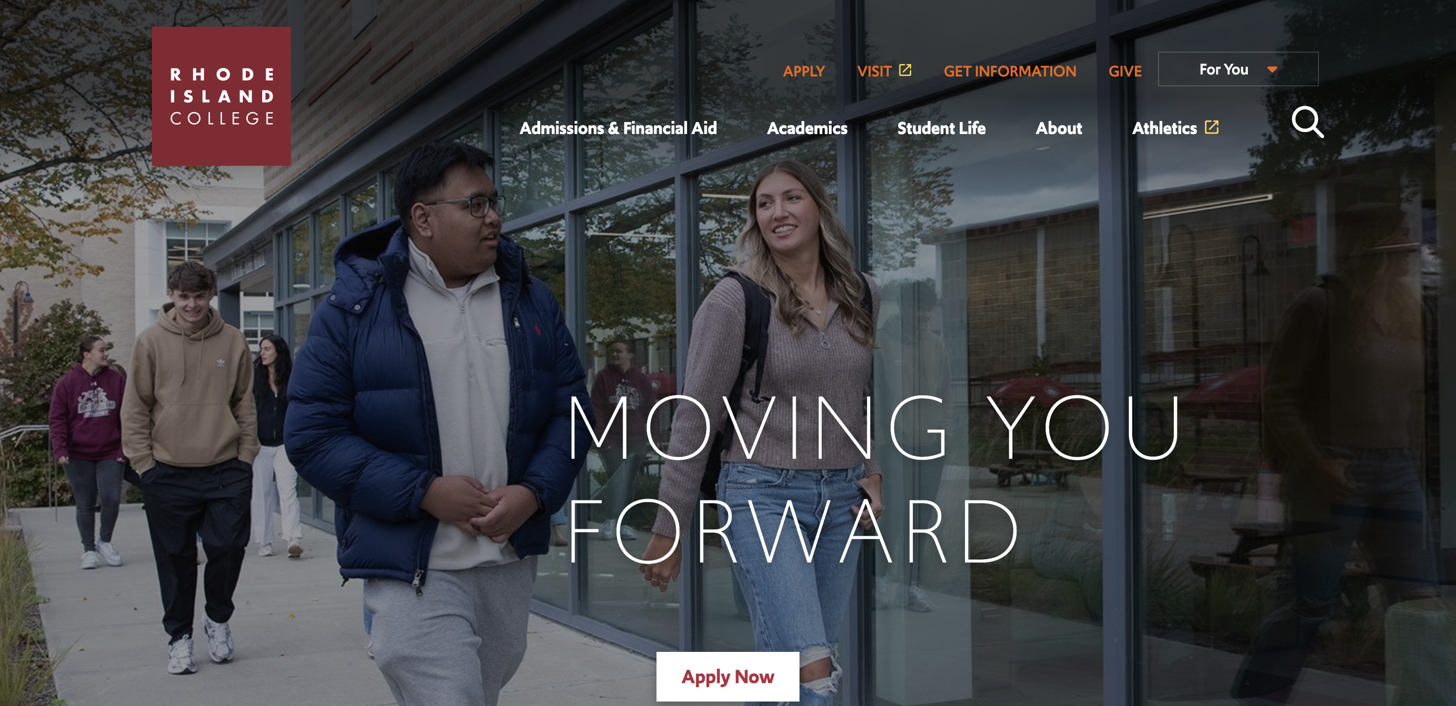
Rhode Island College
Rhode Island College is, as the name suggests, a public college in Providence, Rhode Island, USA.
Rhode Island College’s website is a great example of a navigable campus site, where users can still find admissions info, academic programmes, and services without fighting the interface.
Use this as inspiration for:
- Keyboard-friendly information architecture – When a site is big, keyboard navigation becomes the fastest way through, especially if focus order and menus are treated sensibly.
- Good use of image alt tags – The description of each image on page is clear and relevant.
- Clear interaction states – Selected states and keyboard focus are not decoration, they’re essential context for non-mouse users.
- Resilience in templates – Education sites win when the baseline template is accessible, so new pages don’t ship new accessibility problems every week.
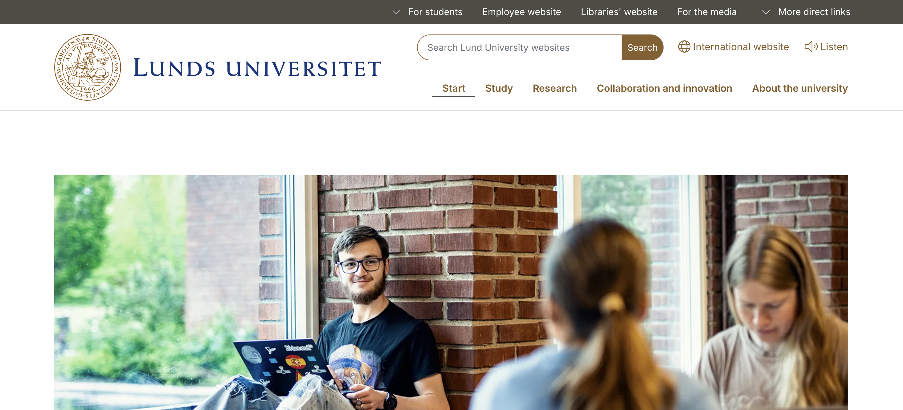
Lund University
Lund University is a major Swedish university founded in the 17th century, with a large international presence.
Lund University’s site is a good model for multilingual, content-heavy sites that still feel coherent, which matters because language switching, long pages, and mixed layouts can create accessibility barriers fast.
Look for inspiration in:
- Legible layouts and spacing – Long-form pages should avoid “2D scrolling” traps on small screens, meaning they require both horizontal scroll and vertical scroll.
- Predictable navigation menus – Consistent placement and behaviour reduce cognitive load.
- Clear link intent – When links open new tabs or change context, users should be warned. especially screen reader users who don’t get the same visual cues.
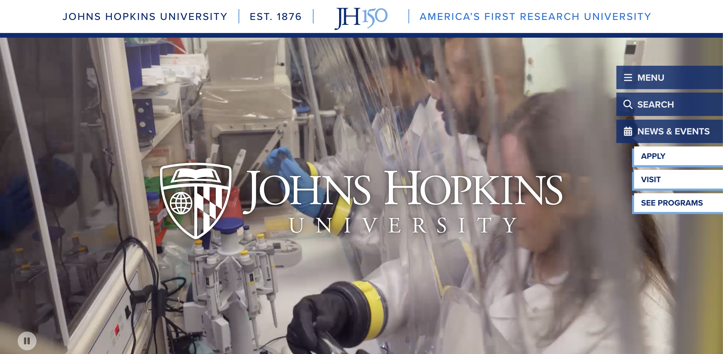
Johns Hopkins University
Johns Hopkins University is a private research university in Baltimore, Maryland.
JHU is especially useful as inspiration if your site includes lots of PDFs, reports, and research content, because document accessibility is where most websites quietly fail.
A few practical takeaways:
- Don’t treat PDFs as a loophole – Screen readers need tagged structure, including headings and reading order to make sense of documents.
- Use real headings, not styled paragraphs – It’s one of the fastest ways to help people navigate by structure.
- Design for scanning – Clear major sections, consistent heading levels, and meaningful link text give users a better sense of where they are.
Web accessibility examples for government sites
Government sites carry a different kind of responsibility. They often have explicit web accessibility requirements, they serve everyone (including disabled people), and they need to work under stress – think healthcare information, financial services, or emergency updates.
This is also where accessibility statements matter: in many jurisdictions, public-sector website owners are expected to publish an accessibility statement and show ongoing progress.
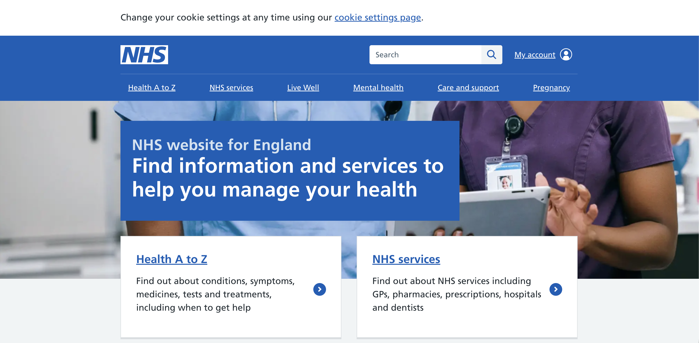
The NHS
The NHS (National Health Service) is the UK’s publicly funded healthcare system; NHS.uk is a primary digital front door for health information and services.
There’s a useful design lesson here: NHS.uk is often described as utilitarian, but that’s not a bad thing. In the UX community, people regularly point to the NHS and the GOV.UK website patterns as examples where clarity beats pretty, especially when users need answers fast.
Of course, it might not be suitable for e-commerce sites, but it works well when clarity of information is paramount.
Use the site as inspiration for:
- Plain language and obvious hierarchy – Reduces cognitive load and helps everyone, not just users with disabilities.
- Large, readable text – The NHS website prioritizes readability and, despite having a lot of text on the page, the font size is larger than many other websites. Utilize both white space and clear font to make your site navigable.
- Navigation that’s easy to recover from – Users should never feel “stuck” in a flow.
- Consistency over cleverness – Predictable patterns are accessibility features.
The NHS has a number of regional websites, so if you want to see the best of the best, check out the Royal Cornwall Hospitals NHS Trust.
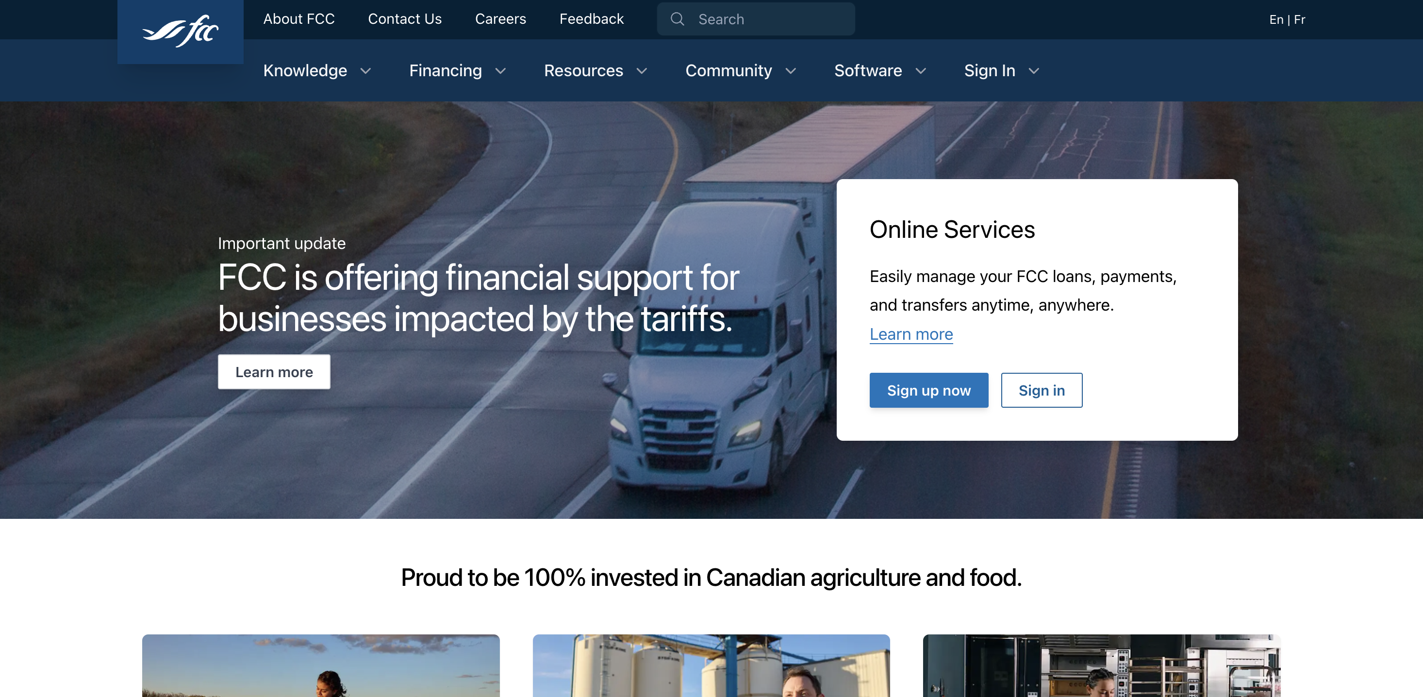
Farm Credit Canada
Farm Credit Canada (FCC) is a Canadian government-owned lender focused on agriculture and food, offering financing and resources for producers and agribusiness.
The FCC website is a strong example of a services site that still keeps the basics right: structured content, clear navigation, and a foundation that makes online services easier to use for a wide range of online users.
Takeaways:
- Accessible “service portals” aren’t just forms – They’re navigation, authentication, error recovery, and content clarity.
- Semantic structure matters – Properly marked-up lists, headings, and tables make information presented far easier for screen readers.
- Build for real contexts – Bright sunlight, small screens, slow connections, and assistive tech all benefit from the same disciplined UI choices.
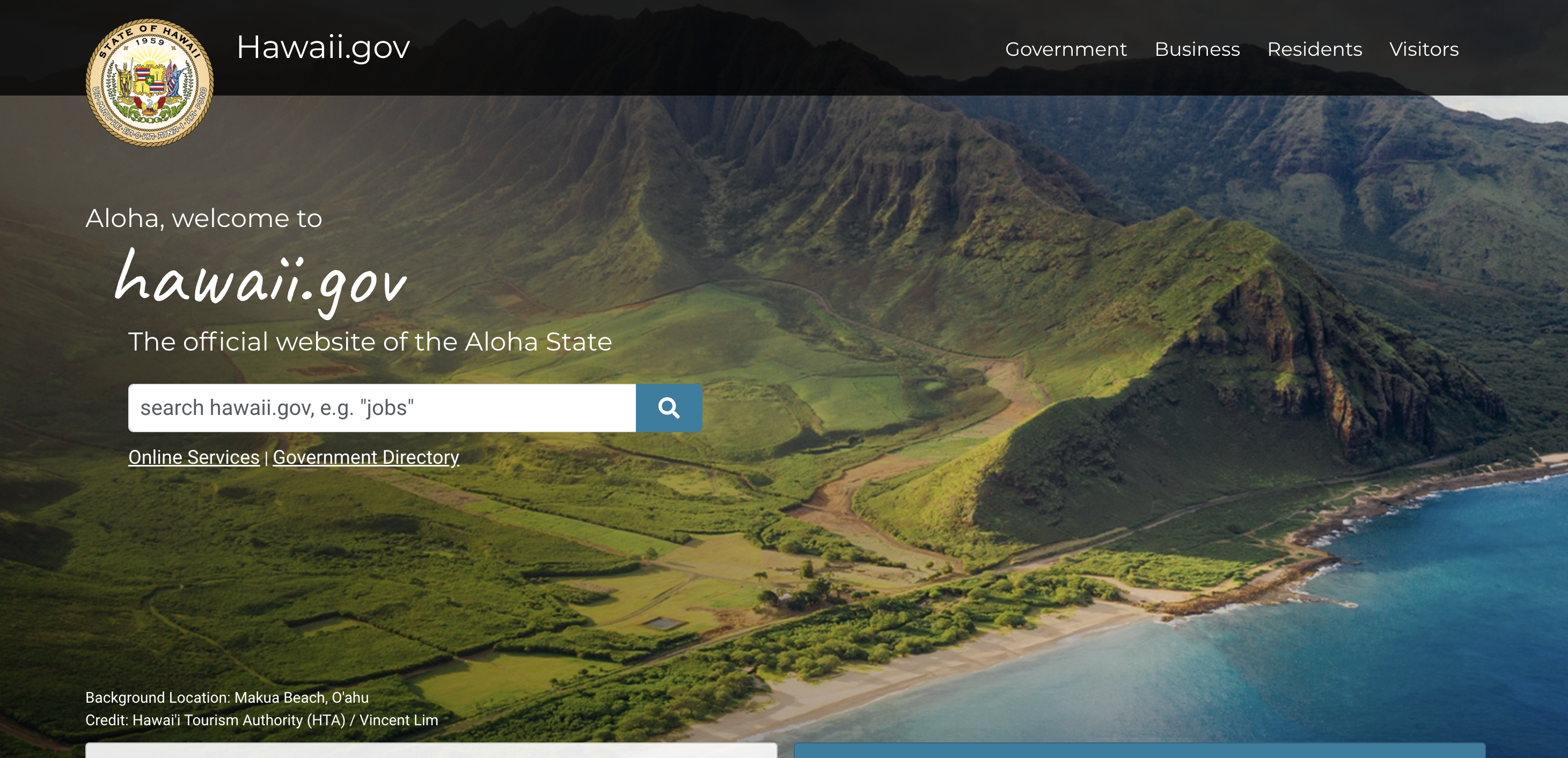
State of Hawaii
Hawaii’s portal is the archipelago’s gateway to online services and information for residents, businesses, and visitors.
The State of Hawaii’s site is particularly relevant if yours includes lots of service entry points – such as logins, payments, renewals, and applications – because those flows are where accessibility problems get expensive.
Patterns worth copying:
- Good text and background contract – Despite using an image of scenic Hawaii as a background, the text is easy to read. Be considerate with what’s on your page backgrounds.
- Form field clarity – Labels, help text, and errors need to be programmatically connected so screen readers announce the right thing at the right time.
- Keyboard focus discipline – Portals often add sticky headers, banners, and dialogs that accidentally hide focus, which is a WCAG 2.2 priority.
- Descriptive links – “Apply now” is fine visually, but repeated identical link text can be a nightmare in a links list.
Web accessibility examples for B2B sites
Like their B2C equivalents, many B2B sites get judged on checkout conversion, credibility and clarity. B2B pages are often packed with the exact things that cause accessibility barriers: dense content, resource libraries, gated PDFs, embedded video, complex navigation, and lead-gen forms.
If you want an accessible website in B2B, aim for:
- Clean heading structure and readable layouts
- Good focus states on all interactive components
- Forms that work with keyboard and screen readers
- Content that’s easy to scan and re-read
Here are three examples of websites that have done it right.
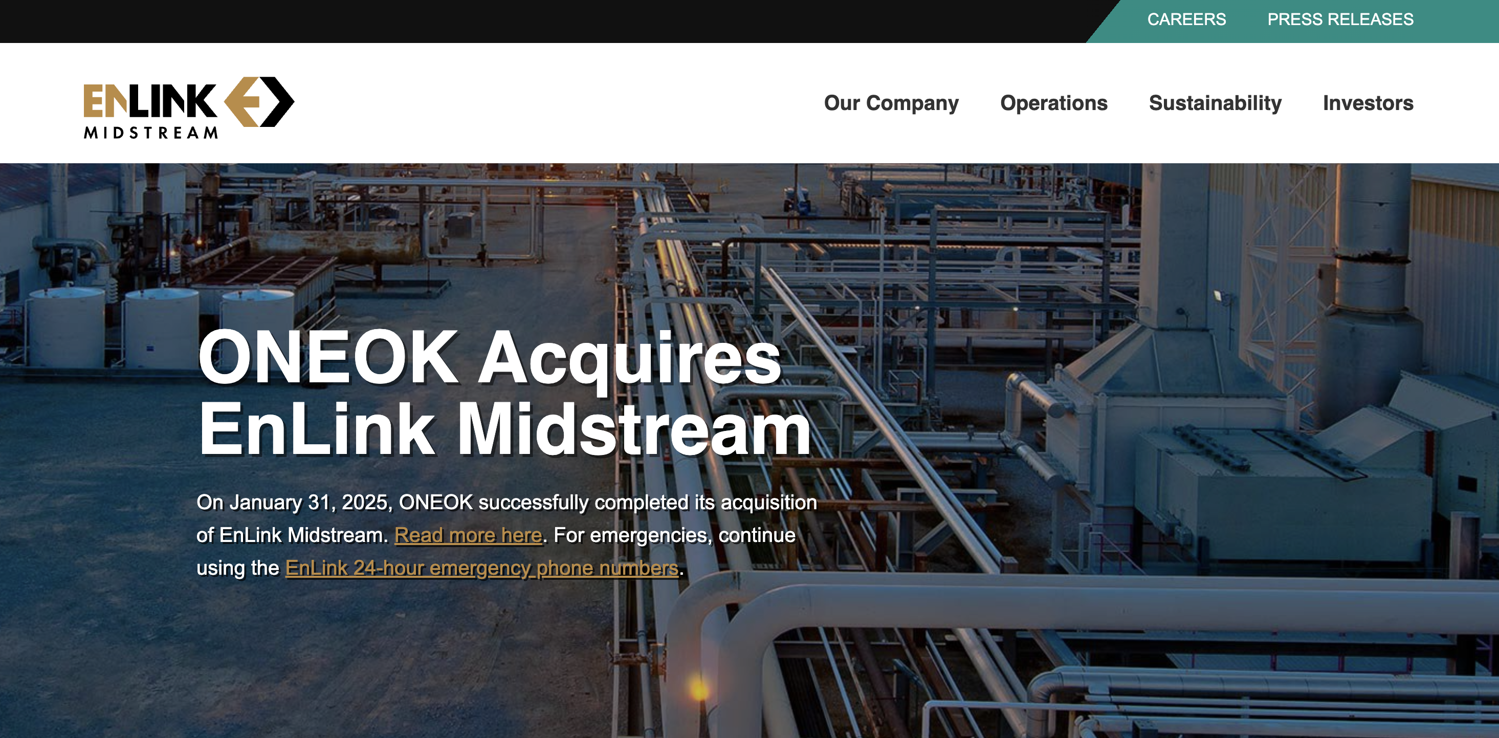
EnLink Midstream
EnLink Midstream is an energy infrastructure company focused on midstream services – gathering, processing, transport, and logistics.
Even “industrial” sites benefit from accessible design patterns, because investors, partners, job candidates, and regulators all rely on the same web content.
What to take inspiration from:
- Document and report UX – Investor content often lives in PDFs; treat them as first-class citizens.
- Simple navigation that doesn’t fight users – Predictable menus and clear page titles help users orient quickly.
- Don’t overlook contrast: – B2B brand palettes can be subtle, so keep a close eye on color contrast and non-text contrast (icons, focus outlines).
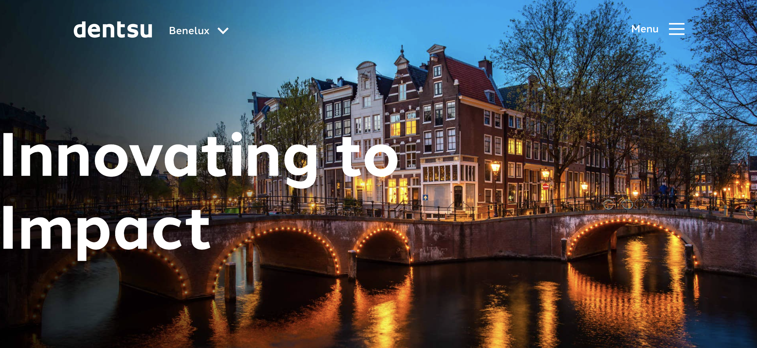
Dentsu
Dentsu is a global advertising and marketing network offering services across media, CX, creative, and digital transformation.
Agency sites tend to be animation-heavy, visually complex, and full of bespoke components, which is the exact recipe for keyboard traps and screen reader confusion.
Copy these habits if you want your site to succeed:
- Treat focus like a design system component – Every carousel, modal, and nav element must have predictable keyboard focus.
- Use ARIA tags intentionally – They’re powerful, but they can also create accessibility problems when overused or inconsistent.
- Respect motion preferences – Animation is fine; surprising, unavoidable animation is not.
- Use negative space – having blank sections of your website reduces clutter and helps improve readability.
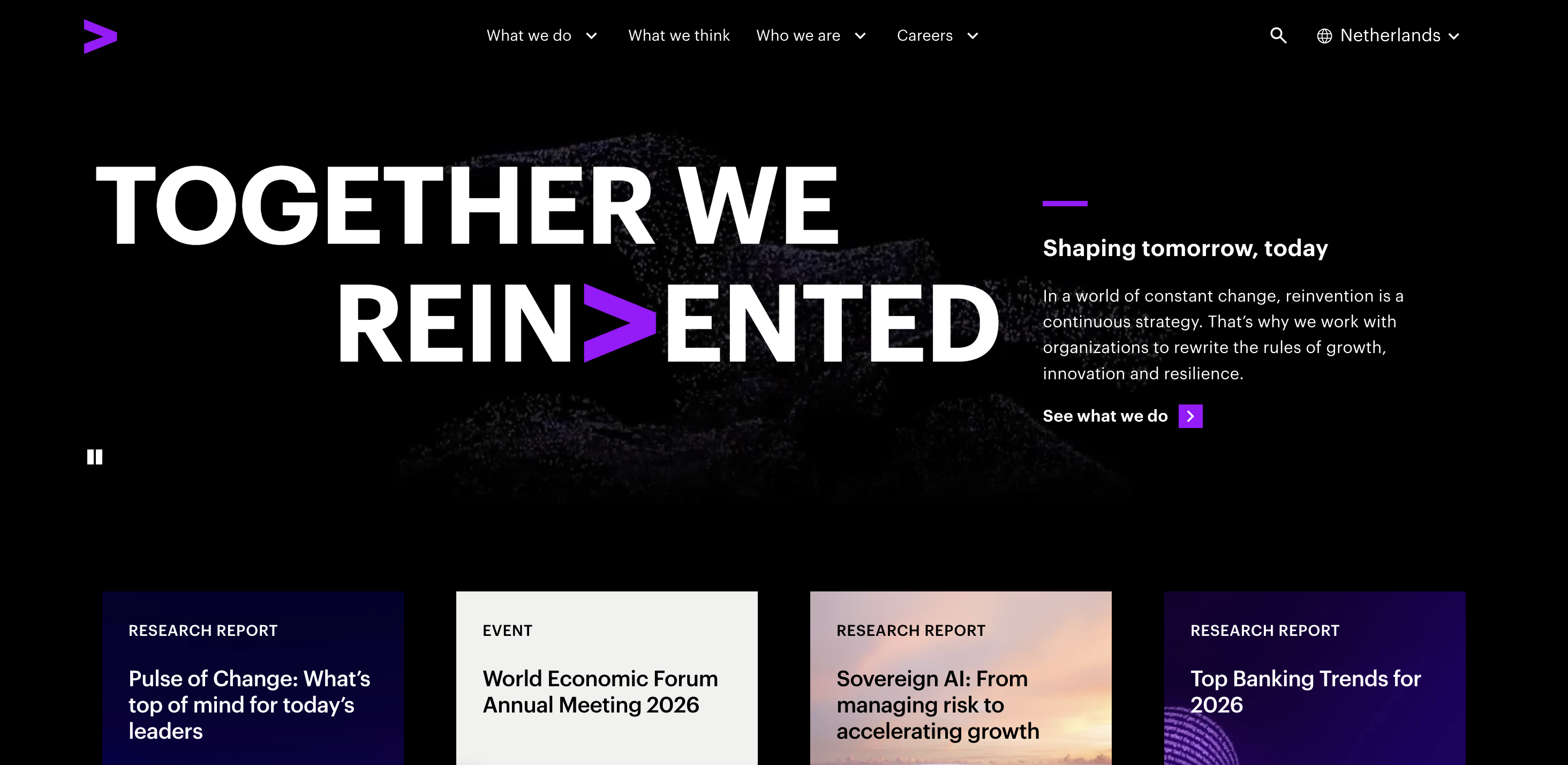
Accenture
Accenture is a global professional services company focused on consulting, technology, and operations
It’s also following a useful pattern: high-performing sites often aren’t “done,” they’re just working on the last 10%, as there are still some improvements being made, such as ensuring focus isn’t obscured, can improve accessibility and adding relevant alt text.
Here’s some inspiration to take from the website.
- Selected-state clarity – Buttons and toggles must clearly show when they’re active, both visually and programmatically.
- Focus is not obscured – Sticky UI should never hide the focused element.
- Clear context changes – If a link opens a new tab, say so.
Web accessibility examples for B2C sites
B2C brands serve massive audiences on messy real-world devices. That means accessibility isn’t a niche feature; it’s core product quality.
Here are the big three accessibility concerns to obsess over:
- Keyboard access – Tab key flows, no traps, and visible focus.
- Assistive technology compatibility – Screen readers and voice control
- Content clarity – Clear instructions, readable layouts, and sensible page structure
Here are three sites doing it right.
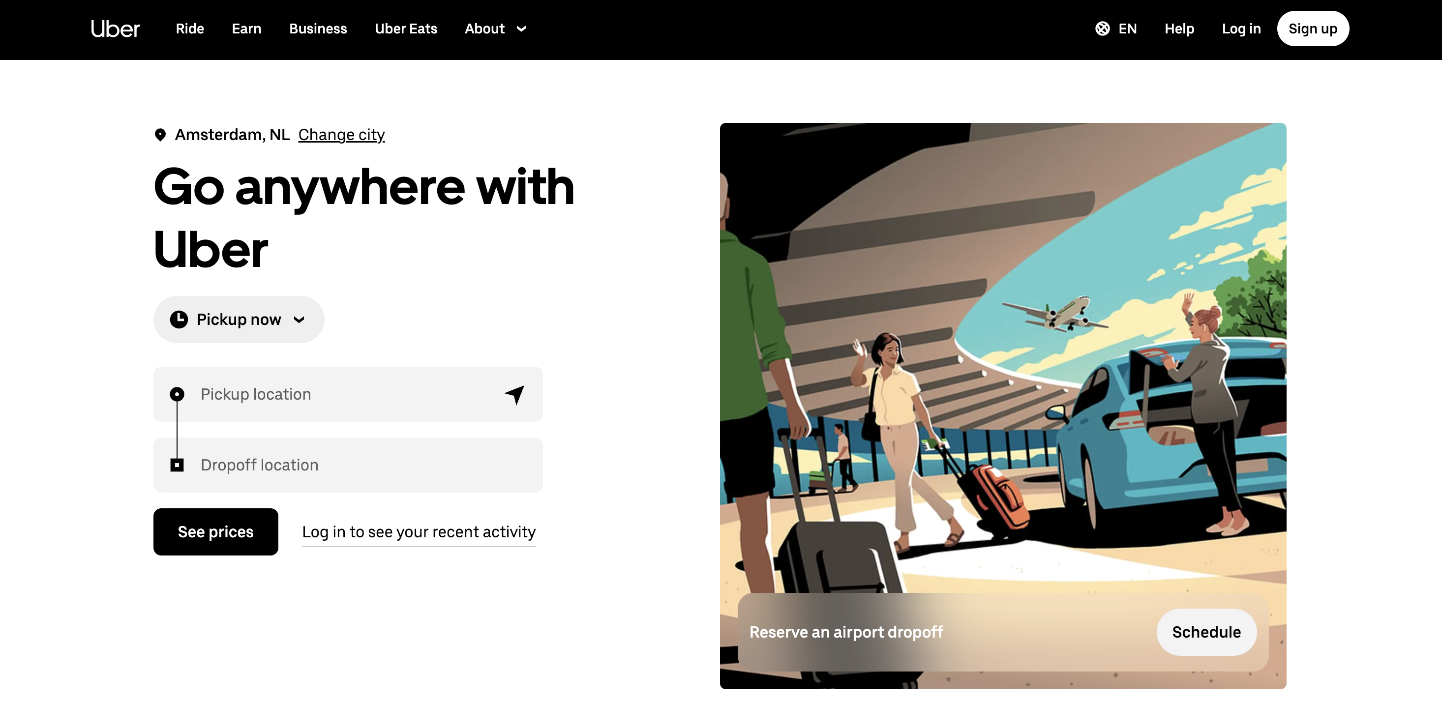
Uber
Uber is a mobility and delivery platform, known for ride-hailing, delivery, and logistics services.
Most users will experience uber’s offering through an app, but the taxi and delivery company (among other things) still prioritizes having an accessible website.
Copy these principles:
- Make tap targets forgiving – Interactive components should be far enough apart, as this helps users with motor impairments and anyone on a phone.
- Use real lists – Screen readers rely on semantics, and fake lists slow people down.
- Keep focus visible and stable – If your page has sticky elements or overlays, test focus as you scroll.
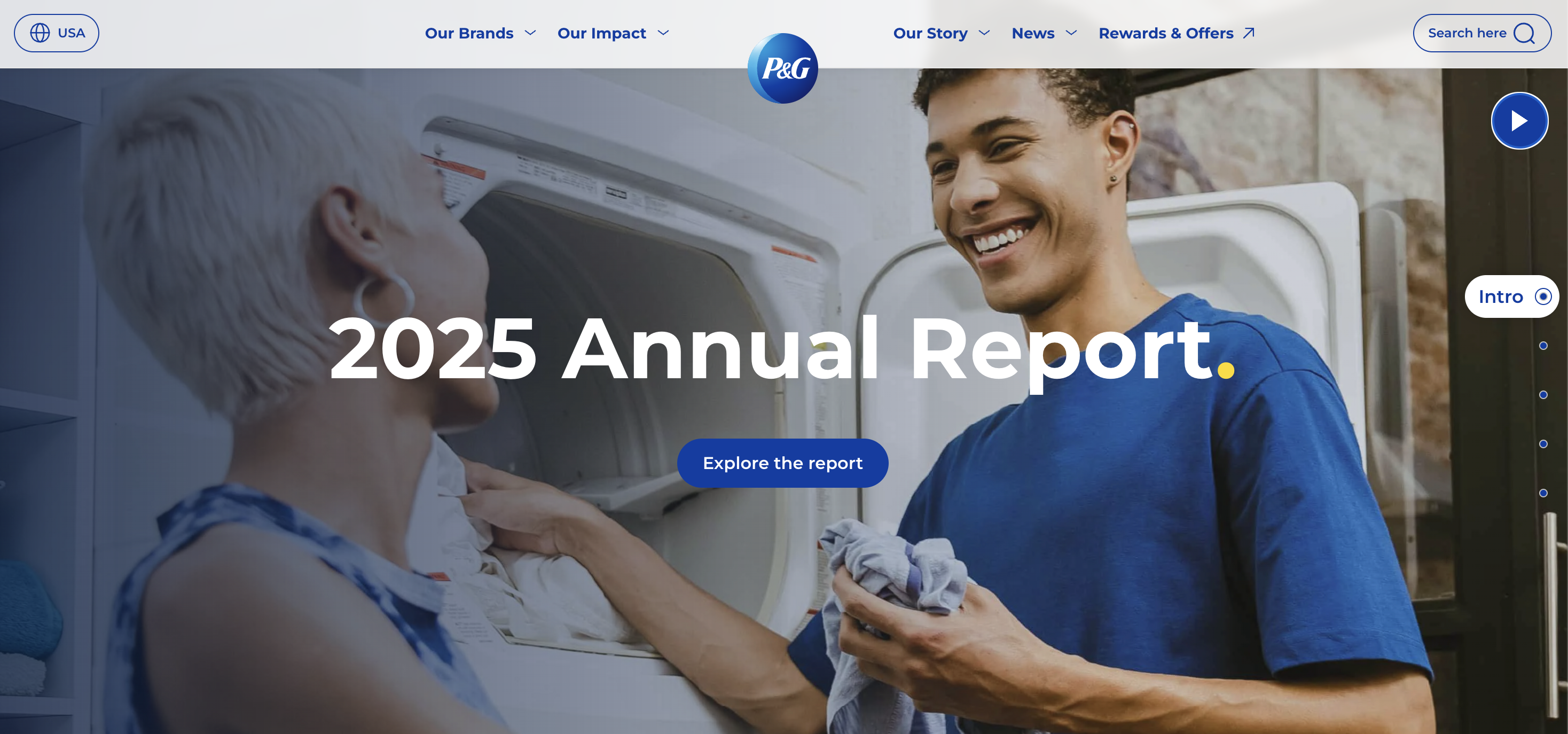
Procter & Gamble
Procter & Gamble (P&G) is a global consumer goods company with a large portfolio of household brands.
The company prioritizes clarity and readability, while also allowing users to pause and interact with carousels.
Good habits to borrow:
- No dead links, no dead anchors – Skip links and table-of-contents links must land correctly.
- Consistent selection states – If something is selected, users should never have to guess.
- Structured content wins – Especially on corporate pages with long scrolling content.
- Clear indications of outbound links – An arrow in each external link in the footer makes navigation clearer.
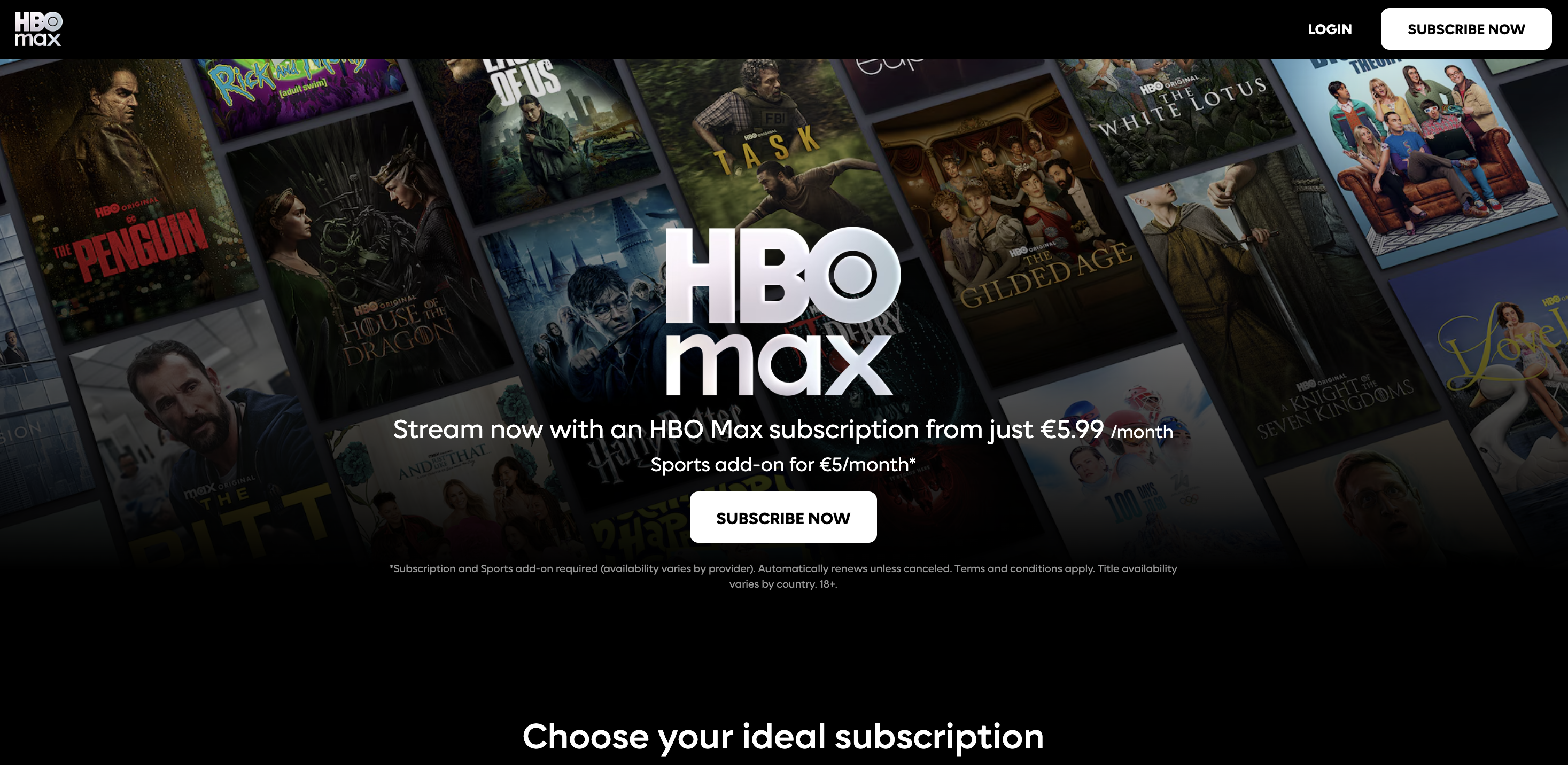
HBO Max
HBO Max (now commonly branded as “Max” in some markets) is a streaming platform associated with Warner Bros. Discovery.
HBO Max is a leading example in the video streaming industry. For a category dominated by heavy sites and apps, it’s a useful reminder: accessibility isn’t only about text and buttons; it’s also about controls, captions, and compatibility with assistive tech.
If you ship video or audio experiences, use HBO Max as inspiration to audit:
- Keyboard-operable players – Play/pause, scrub, volume, and fullscreen should all be reachable and operable.
- Clear focus styling inside custom controls – Most streaming UIs are custom; don’t remove focus outlines without replacing them.
- Accessible media options – Captions and audio descriptions are where inclusive design becomes tangible.
Key takeaways
Across these 15 examples of web accessibility, you’ll notice a consistent theme: the best teams don’t treat accessibility as a one-time project, they treat it as an ongoing quality practice like performance or security.
A simple, repeatable workflow looks like this:
- Start with standards – Use WCAG guidelines as your shared language (most teams aim for Level AA).
- Automate what you can – Automated checks catch missing labels, contrast issues, broken headings, some ARIA tag problems, and other common accessibility problems.
- Manually test the critical paths
- Navigate with only the Tab key, watching for keyboard focus and keyboard access
- Smoke-test with a screen reader – even 10 minutes can reveal a lot
- Check color contrast and non-text contrast
- Review complex images and multimedia content for accessible alternatives
- Ship fixes fast – The fastest teams reduce friction between finding an issue and merging the fix.
That last step is where Marker.io fits neatly into an accessibility program.
Marker.io is a visual website feedback and bug reporting tool that enables you to capture issues with screenshots and annotations, and send them directly into tools like Jira, Trello, Asana, GitHub, and more – along with technical context like console logs.
For accessibility work specifically, Marker.io also positions an accessibility workflow where it scans pages for WCAG issues and turns them into triage-ready items, helping teams spot problems earlier and reduce context switching.
In practice, that means:
- Designers can flag UI issues like unclear focus indicators or low contrast.
- QA can capture reproduction steps – e.g., keyboard-only path and screen reader output – and attach them to a ticket.
- Developers get clean, actionable bug reports instead of vague “accessibility is broken” notes.
Accessibility isn’t just about compliance or avoiding legal risk, it’s about building sites that don’t exclude people. The examples above show that accessible design is rarely flashy, it’s just consistently considered.
What should I do now?
Here are three ways you can continue your journey towards delivering bug-free websites:
Check out Marker.io and its features in action.
Read Next-Gen QA: How Companies Can Save Up To $125,000 A Year by adopting better bug reporting and resolution practices (no e-mail required).
Follow us on LinkedIn, YouTube, and X (Twitter) for bite-sized insights on all things QA testing, software development, bug resolution, and more.
Will Sigsworth
Will manages organic content at Marker.io. He also works as a marketing advisor and contributor to a number of other SaaS businesses.

Get started now
Free 15-day trial • No credit card required • Cancel anytime