Web Typography 101: Best Practices & How To Pick a Font
Learn how to optimize web typography for performance and visual appeal. Read our tips on font selection, pairing, web-safe options, and more!


Does your font look great but slow down your site? Or maybe it loads quickly but doesn’t quite capture the visual appeal you’re aiming for?
Fonts play a huge role in how people perceive your brand.
Getting the right balance between performance and aesthetics is key.
In this post, I’ll show you how to achieve both: speed and style.
I’ve spent years experimenting with fonts—tweaking, learning, and even creating my own.
Now, I’m here to share those lessons with you.
Why fonts matter in web design
If you don’t care about your web design and just want absolute, pure performance on your site, try this CSS:
font-family: system-ui, sans-serif;
System-UI is a generic font family that tells the browser to use the operating system's default UI font.
For example, it would use San Francisco on macOS, Segoe UI on Windows, and Roboto on Android.
If the system-ui font is not available, the browser will fall back to a generic sans-serif font.
But…
Fonts are more than just letters. They represent your brand's personality.
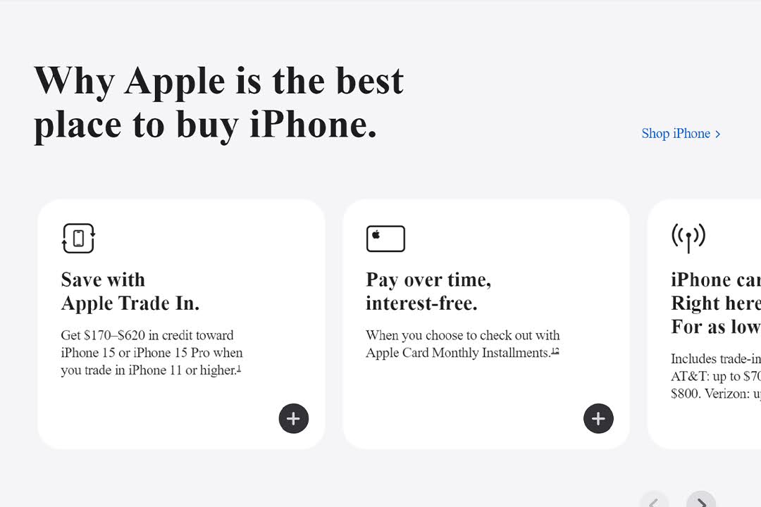
As an example, below is a screenshot of one of the most famous websites in the world:

Apple's design stands out due to its colors and font.
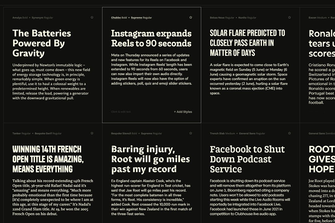
Don’t believe me? Here's the same page with a serif font instead:
Not Apple anymore, right?
Common font mistakes to avoid
Here are some common web design sins:
1. Font overload
You’ve got five different fonts on your site.
I get it, they’re all pretty, but this isn’t a scrapbooking session. Stick to two font variations, period.
Any more, and your design starts looking like a ransom note.
2. Wrong weights
Loading every font-weight under the sun? Been there, done that.
This kills your load time. The more weights you load, the more your performance suffers.
And trust me, a 90+ PageSpeed Insights score isn’t worth sacrificing for some extra-bold text.
3. Third-party fonts
Using Google Fonts or another third-party service for fonts might seem convenient.
But it’s a trap. It slows down your site and isn’t always reliable.
Self-hosting your fonts is the way to go.
I made the switch, and it’s one of the best decisions I’ve ever made for performance.
4. Poor legibility
Thin, light fonts might look sleek, but if no one can read your text, what’s the point?
Prioritize readability. Make sure your font is clear, even at smaller sizes and on different screens.
How to choose the right font
The number one rule is not to overcomplicate it.
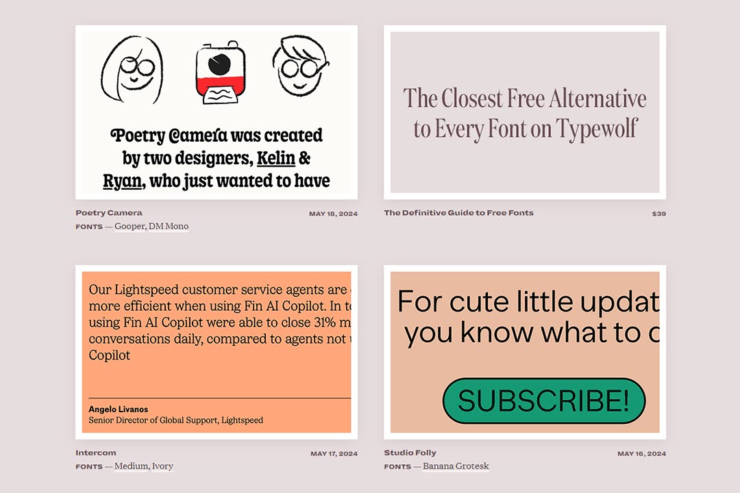
Look for some inspiration on sites like typ or typewolf.
The next step is to look at performance.
Make sure the font has an acceptable size (max. 50kb per font variation).
Then, there's branding.
Are you fun and quirky, or serious and professional? Your font should reflect that.
A playful startup might choose a rounded, friendly font, while a law firm might prefer something more traditional.
Another consideration is that your font should look good at different sizes and weights.
It should also work across different devices.
Play around with a few options, but remember—keep it simple.
Don’t just rely on your own opinion. Gather feedback from colleagues, clients, or even potential users.
Sometimes, an outside perspective can highlight issues you might have missed.
Font pairing
Good typography often involves more than one font. But mixing fonts is like mixing drinks!
Aim for contrast and complementarity. Pair a bold, expressive headline font with a clean, simple body font.
Start with a serif font for headlines and a sans-serif for body text, or vice versa. This classic combo is hard to beat.
There are many font pairing generators online, so you can test out the pair before implementing it on your site.
When pairing a font, use one font for headings and another for body text.
Just remember the rule: no more than two variations.
How to optimize your font for the web
Even after choosing the right font, you will still need to optimize it so it works perfectly on your website.
This might be the most important part of this post.
A couple of months ago I did a complete website re-design.
While I was testing my website for speed, I noticed that it was dealing with two main problems: JS and Font.
Font alone was dragging my performance score by a whopping 25%!
Here's what I did to completely remove that notice.
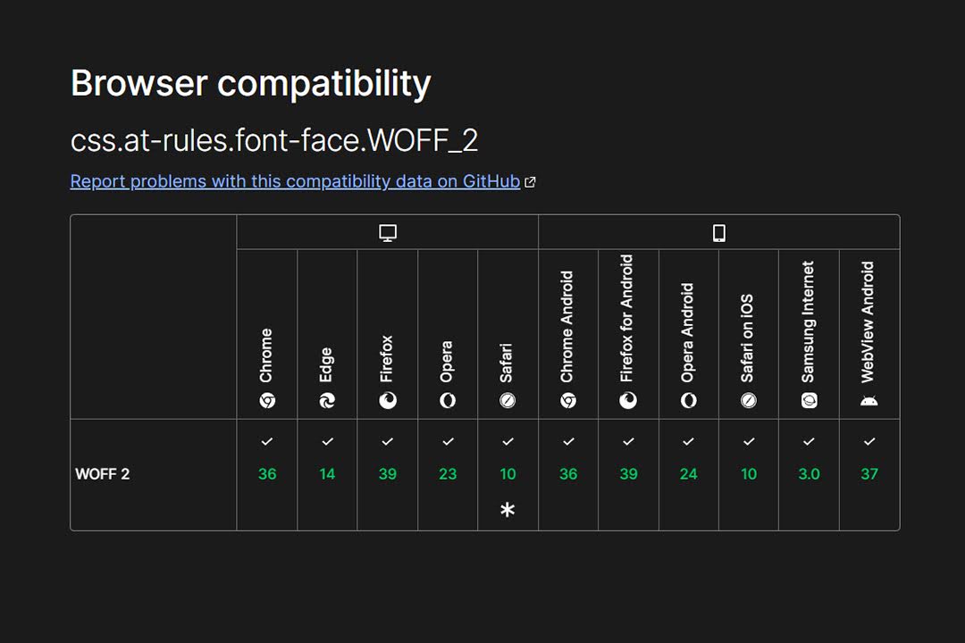
1. Use WOFF2 (or WOFF)
WOFF (Web Open Font Format) is a special font format for websites.
Developed by the W3C, it wraps TrueType (.ttf) and OpenType (.otf) fonts, adding compression and metadata.
It makes fonts smaller and faster to load, which is good for web performance.
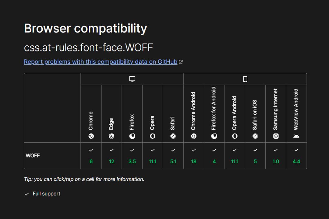
WOFF2 is the improved version of WOFF.
It uses a more efficient compression algorithm (Brotli) and offers even smaller file sizes, ideal for modern web design.
Both WOFF and WOFF2 are widely supported across modern browsers.
If you have a font in another format (like TTF or OTF) and want to convert it to WOFF or WOFF2, there are two tools online that I like:
Font Squirrel and Transfonter.
Jeffrey from Lytbox has an awesome tutorial on how to use Font Squirrel.
2. Serve fonts locally
Using a third-party service for fonts can cause delays if the service is slow or down.
Hosting them locally guarantees a performance boost.
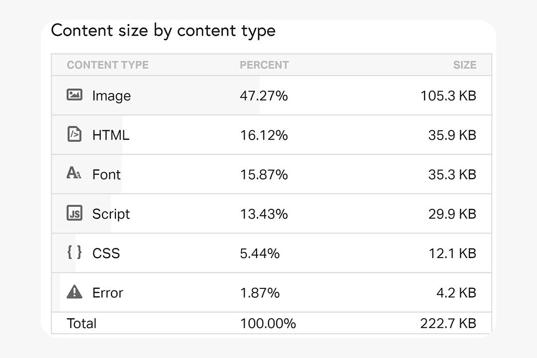
You can run a test on Pingdom to see how your fonts are structured.
If they are hosted locally, it will report them including their size in KB and their resource share.
Here is mine for example:
If you were eyeing for a Google Font, then download your fonts and host them on your own server.
Then, use a Content Delivery Network (CDN) to serve fonts from locations closer to your users.
Google themselves have a guide on how to do this.
3. Make fonts responsive
Your fonts should look great on both large monitors and small smartphone screens without constant size adjustments.
Use responsive units like em or rem instead of fixed sizes like px.
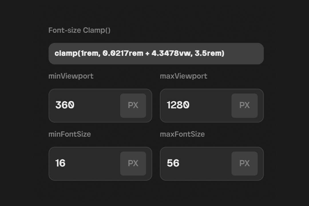
Even better, implement font clamping. I swear by it!
The clamp() function in CSS lets you set a responsive value that adjusts within a defined range. It takes three parameters:
- Minimum value. The smallest value your font size can shrink to.
- Preferred value. The ideal value, usually based on the viewport size.
- Maximum value. The largest value your font size can grow to.
Here’s the syntax:
font-size: clamp(minimum, preferred value, maximum);
For example:
font-size: clamp(1rem, 2vw + 0.5rem, 1.5rem);
Manual calculation is tough, so use a Font-Size Clamp() Generator.
You do this once, test it on a staging environment, and move to the next step.
4. Preload critical fonts
Browsers may delay font loading, causing pages to render with fallback fonts first, known as “FOIT”—Flash of Invisible Text.
Preloading tells the browser to load fonts as a priority.
Add a <link rel="preload" href="your-font.woff2" as="font" type="font/woff2" crossorigin> tag to your HTML.
You can either do this manually or use a plugin like Perfmatters if you’re on WordPress.
Preload only the most critical fonts, like those used in headings.
This can reduce layout shifts and improve perceived performance.
Perceived performance is about how fast your website feels to users, not just actual load time.
It's about creating an experience where users feel things happen quickly, even if they don't.It’s the psychology of speed in web design).
You can read more about layout shifts from the official Google Blog.
5. Subset your fonts (advanced)
Most fonts include characters you'll never use, like special symbols or foreign language characters.
Loading all these extra characters unnecessarily increases the file size.
Subset your fonts to include only the characters you need (e.g., Latin characters only).
You can use the tools mentioned above to achieve this.
6. Use a caching plugin
Caching plugins save a static version of your site, avoiding repeated page generation for each visitor.
Every time a user visits your site, their browser requests your fonts from the server.
If you’re not using caching, this happens on every page load, which can slow things down.
A caching plugin can help reduce or eliminate the Flash of Unstyled Text (FOUT).
If fonts are cached, the browser can display them immediately instead of using a fallback font.
This consistency leads to a more polished appearance.
Famous caching plugins include WP Rocket and LiteSpeed cache.
7. Font accessibility
Everyone should easily read and engage with your content.
Opt for clean, simple fonts like sans-serif that are easy to read on screens. Avoid overly decorative fonts for body text.
Stick to 2-3 fonts max. Too many fonts can make your site feel cluttered and harder to navigate.
General rule of thumb: Start with at least 16px for body text. Smaller sizes can strain the eyes, especially on mobile devices.
Use em or rem units instead of px for scalable text that adapts to user settings.
Use at least 1.5 line spacing and 0.2–0.25em letter spacing for better readability, especially for users with cognitive impairments.
Use tools like WebAIM’s Contrast Checker to ensure good contrast between text and background.
Aim for a contrast ratio of at least 4.5:1 for normal text.
Always define fallback fonts in your CSS. This ensures content is readable even if the custom font doesn’t load.
Typography in web design
We’re not gonna go deep into the principles of Typography here, as it’s out of the scope of this post, but here are a few more elements to keep in mind.
Typography aims to make text legible, readable, and visually appealing.
Basic HTML elements and hierarchy
Here’s a quick rundown of key HTML elements used in web typography:
- Headings (<h1> to <h6>). These elements define the hierarchy of your content, from the main title (<h1>) to subheadings (<h2> to <h6>). Headings should be used logically, with <h1> reserved for the page’s main heading and subsequent levels used for section headings.
- Paragraphs (<p>). The <p> element is the building block for body text. It wraps your content in readable chunks, making it easier for users to consume.
- Lists (<ul>, <ol>, <li>). Use lists to break down content into manageable pieces. Unordered lists (<ul>) are for items without a specific order, while ordered lists (<ol>) are for items that follow a sequence.
- Blockquotes (<blockquote>). This element is used to highlight quotations or excerpts. It’s a great way to add emphasis to important text.
- Emphasis and Strong (<em>, <strong>). These elements are used for emphasis. <em> italicizes text, while <strong> makes it bold. Both add importance to specific parts of your content.

Web-safe fonts vs. Core fonts
In the early days of web design, fonts were a nightmare.
If you wanted to use a specific font, you had to hope your visitors had it installed on their computer. If they didn’t, good luck!
Web-safe fonts were created to solve that.
They are a group of fonts that are universally available on most devices and operating systems (things like Verdana, Times New Roman, and Courier).
Core fonts extend this concept, focusing on readability and accessibility across different platforms.
Common core fonts include system defaults like Helvetica, Arial, and Georgia.
Serif vs. Sans-Serif
Serif fonts have small decorative strokes at the end of each letter.
They’re often associated with tradition, authority, and formality (Times New Roman, Georgia...).
Sans-serif fonts, as the name suggests, lack the decorative strokes.
They’re cleaner, more modern, and often easier to read on screens (Helvetica, Inter, Open Sans...).
If you’re in tech, no questions asked: sans-serif.
But if you are a formal brand, perhaps a publication, or have long-form content, I’d go with serif.
It’s that simple.
Wrapping up...
Typography shapes your audience's experience and can make or break your site's design.
Avoid common mistakes like using too many fonts, overloading weights, or ignoring legibility to create a site that looks great and works well.
Good typography takes thought, strategy, and yes, a bit of trial and error.
Now go out there and make your typography something worth talking about!
What should I do now?
Here are three ways you can continue your journey towards delivering bug-free websites:
Check out Marker.io and its features in action.
Read Next-Gen QA: How Companies Can Save Up To $125,000 A Year by adopting better bug reporting and resolution practices (no e-mail required).
Follow us on LinkedIn, YouTube, and X (Twitter) for bite-sized insights on all things QA testing, software development, bug resolution, and more.
Nathan Vander Heyden
Nathan is Head of Marketing at Marker.io. He used to work as a SEO consultant for various SaaS companies—today, he's all about helping Web Ops teams find more efficient ways to deliver bug-free websites.
Jabez Tadesse
Jabez is a Founder @ Xrilion and the Mind behind TheTrends, a platform that finds new internet trends with the potential to become widely popular. He was formerly a UX designer, and his website has been featured on Awwwards for best web design.
Related blog posts


Get started now
Free 15-day trial • No credit card required • Cancel anytime