Website Redesign: How to Revamp your Website [Step-By-Step]
In this article, we take you through a step-by-step approach to redesigning and revamping your website.


In this article, we take you through a step-by-step approach to redesigning and revamping your website.
As businesses grow and evolve, that starter website begins to look outdated, if not straight up embarrassing.
It’s time for a website redesign!
The challenge is knowing how to get started revamping and overhauling a website.
What are the steps that can’t be missed if you want a website to stand out—with improved functionality, good branding, and a user experience that improves conversion rates?
What is a website redesign?
A website redesign is when you revamp, overhaul, and in some cases, pull apart and almost start from scratch a website that’s already live.
The result is a website that looks new, shinier, and reflects where you are as a company now, instead of several years ago.
A website redesign is a great way to reflect a pivot, an improved unique selling point (USP), new products or services, or simply a refreshed branding overhaul.
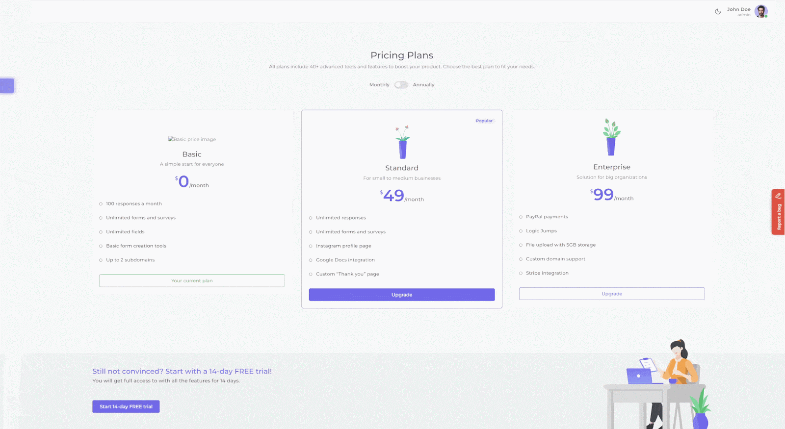
Need a bug tracking tool for your website redesign?
Try Marker.io free for 15 days and make it easier for team members to give design feedback, report bugs, and automatically have this sync with your PM software.
Pricing: starts at $39/mo.
Why redesign your website?
Web design (and redesign) takes time.
It’s typically a few months long project—so, it makes sense to wonder why you’d want to go through this at all.
There are a number of reasons businesses redesign and overhaul their current site, such as:
- Messaging and branding no longer fit;
- Product or service pivots or entered new markets;
- Visually outdated, and that shows in a reduction in the number of website visitors;
- High bounce rate and low conversions, and data/analytics suggests this is a UX design or UI problem as much as a visual and web copy challenge that needs to be overcome;
- Poor call-to-action (CTA) throughout, negatively impacting conversion rates;
- Outdated and falling behind SEO best practices, such as accessibility, responsiveness, and load times;
- Google Analytics and web visitor heatmaps indicate that some web pages would benefit from an overhaul to improve website performance;
- etc.

A few months back, we went through a website redesign ourselves.
For us, it was a matter of misalignment with branding. We had a “starter” website that looked decent, was sturdy, and worked as well as could be expected.
At first, we used a library called “Humaaans” for illustrations. But as time went on, it started to feel a bit too silly, colorful, and childish for our brand.
We also needed to flip our thinking when it came to the website.
It wasn’t about how it looked. Although that’s always an important consideration, what we really wanted is to be able to get our
message across a lot better. Put the value proposition front and center.
Visuals and design are important, of course. Rebranding can work wonders.
But at the same time, we need to remember the importance of web copy and search engine optimization (SEO) when implementing a website redesign project.
We used April Dunford's "Obviously Awesome" framework to identify the story we wanted to tell:

In this framework, the focus is on what the customers think and say about the product, not what we think about the product.
Focus on finding the “jobs-to-be-done” that your product solves instead of talking about features and functionality.
It’s a common early-stage mistake with a lot of SaaS businesses, and one we corrected by incorporating customer interviews in the redesign process.
If you decide to put your message at the core of your web redesign, you might want to stay away from flashy visuals and busy designs.
For us, we wanted to make it abundantly clear that the product just works.
We went minimalist, with a focus on the client insights. You can find inspiration anywhere, just be sure to make it your own and not copy others.
- We took inspiration from our partners and integrations. It is a fun way to choose colours that are recognisable and pay tribute to our partnerships.
- Another source of inspiration were other SaaS tools. We looked at many websites and highlighted the things we enjoyed to give our own spin to.
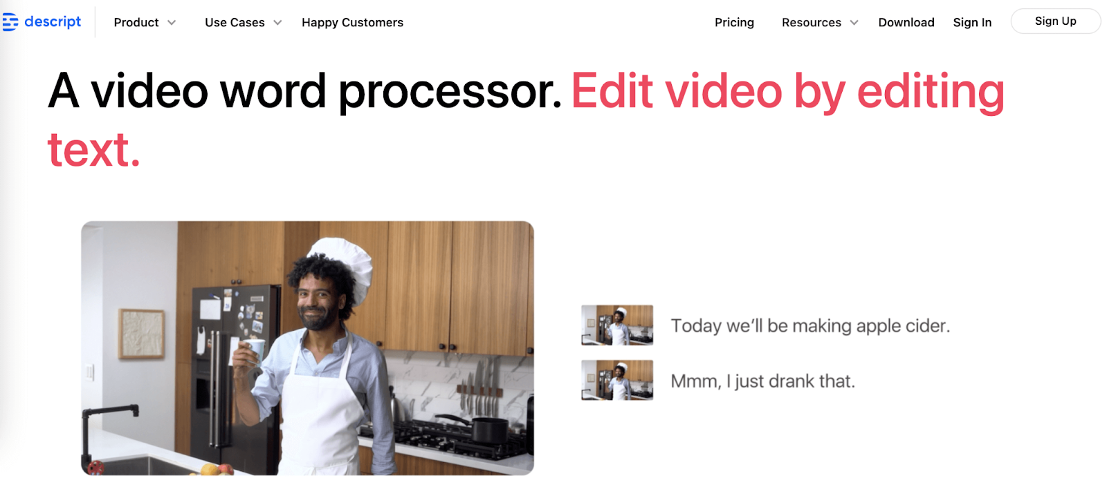
For example: Descript. Their branding is bold, simple yet colourful, and copy-focused. We liked those elements and incorporated them into our own website:
Here’s what we learned from this process and our checklist for revamping a website.
Let’s dive in.
7-Part Website Redesign Process: Step-by-Step Checklist
Here are the 7 steps we recommend you follow to redesign a website effectively.
1. Define your goals, branding, and messaging
At the start of any web development project, whether it’s a new site or revamp, you need to define your goals.
Stakeholders should weigh in. Get together to create the redesign strategy. What are the business goals for the existing website, and what should be the goals for the new one?
In most cases, businesses are looking to:
- Increase web traffic
- Get more sales leads
- Improve the conversion rate
- Optimize performance and page load speeds
Maybe you’re rebranding at the same time. In this case, a brand and design overhaul will be integral to the redesign plan.
Increasingly, a redesign strategy is also metric-based, and there are numerous tools showing how web visitors are using your site and where you can make improvements.
Even the tiniest changes could have a big impact on bounce, conversion, and click-through rates—for SaaS and eCommerce alike.
Our redesign goals were to improve our messaging and branding. We wanted a more customer-centric approach, e.g., “How would customers describe our tool?”
For this, you need to do extensive customer research.
2. Conduct customer research
Most businesses, when redesigning a website, do mockups, wireframes, craft copy, and then present it to their target audience/potential customers.
We suggest doing this the other way around. Start with customer research, and use it as the basis for messaging⏤so that your website is presented in the way that your customers see your company/product.
We thought it was best that the tagline came from the mouth of the customer, and we used that as our revised positioning.
Instead of “bug reporting tool”, our homepage now says “send feedback and bug reports without leaving your website.”
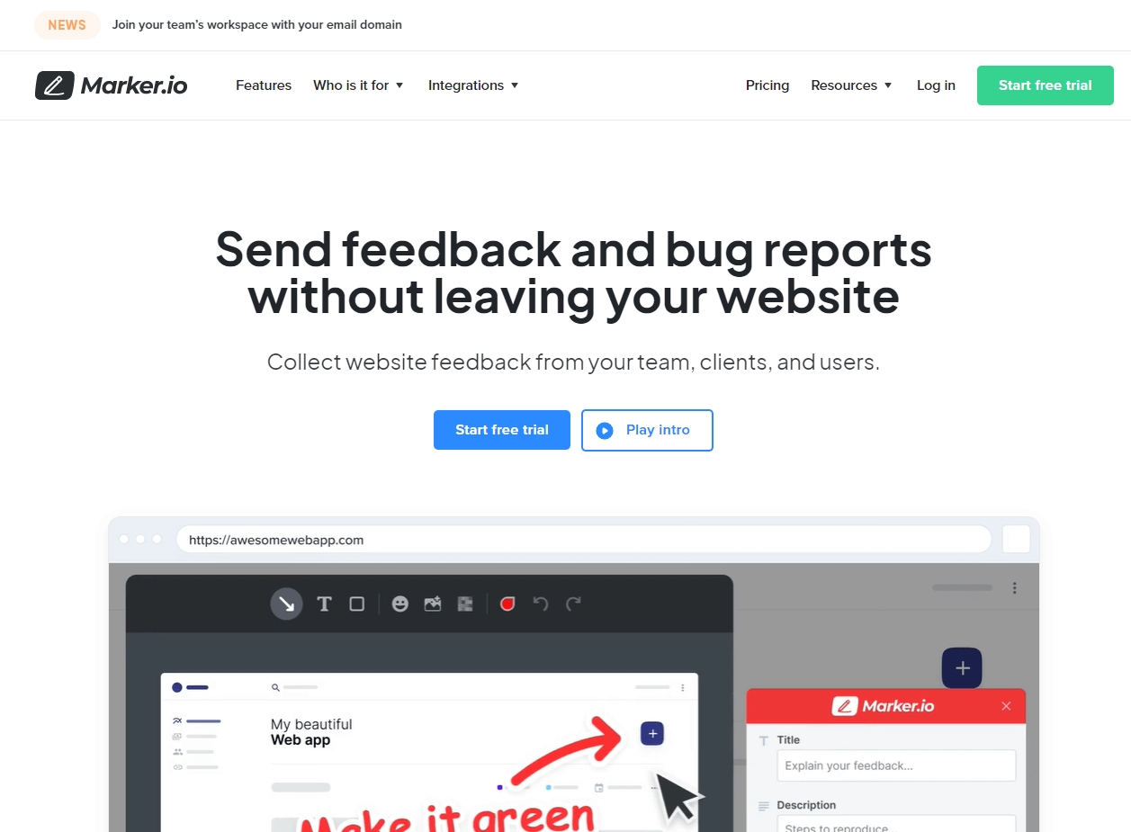
This converts way better, and communicates our value proposition clearly, too.
All we had to do was set up a couple of interviews with our best customers.
They talked freely and happily about how we helped them and what they liked and wanted to see added.
We incentivized them with a sneak peek into the product roadmap in exchange.
These valuable customer insights form the basis of our messaging, SEO, and even content strategy.
3. Analyze the competition
A website redesign is a useful opportunity to evaluate your competitor’s websites.
Take stock of their strengths, weaknesses, and ways you can improve your current website’s functionality, features, usability, messaging, branding, and social proof (e.g., testimonials, case studies).
You might find that a competitor's website structure would be useful to imitate without copying too overtly.
Even if a competitor is a VC-backed, series B market leader, there are always ways to stand out.
4. Choose the right software and content management system (CMS)
Choosing the right software, platform, and CMS is underestimated but extremely important!
For us, it was a matter of ownership and workflow.
Before using Webflow, we had a custom-built platform for our previous website. That meant our designer or developer had to take care of everything whenever the marketing team wanted to change anything with the website.
Our marketing team would do mockups like this in Whimsical.
But after changes went live (or even before), there were problems, e.g., too much copy, too little, wrong image size, etc.
It made a lot more sense for the website to be owned by the marketing team.
With Webflow, the marketing team can take care of everything—from design elements to full website pages.
It’s a lot easier to manage.
5. Prototyping
The collaboration between your marketing team (or your client) and the design team is fundamental to the redesign strategy.
The best way is to start small, working on a micro-level.
Instead of having 100 pages mapped out and prototyped in Figma or another collaborative design tool, with a ton of web copy in Google Docs, start with core pages that you can use as the basis for the rest of the website.
For example, “Home,” “Features,” “Services,” and “Case Studies” are always going to be some of the most important pages for any service-based or SaaS business.
Take more time working on every aspect of one page first.
Make that as close to perfect as possible. Go through every feature, word, button, icon, call-to-action, image, and web copy.
Get those right, and the rest of the pages will be easier to implement.
Ask for feedback early on. Make sure that feedback is as much about the overall structure and design as the tiny details.
Once that page is ready, move on to the rest of the website.
For this to go even smoother, we recommend following the next step closely.
6. Create a 1-page style guide
Now you’ve got a prototype page, use it to make a 1-page quick-reference style guide.

It’s not part of the website, it exists so you can easily copy frameworks, icons, buttons, fonts, and other crucial design elements that will exist across the website.
To make this easier:
- Use a simple class system for writing CSS that’s scalable and maintainable, such as OOCSS (Object Oriented CSS);
- Now you can apply these anywhere these modules and features align and are needed to fit in with your components;
- Also include anything else you’re going to need across the website, such as font, images, buttons, icons, and links;
- Compress and optimize every image you’re going to use;
- Add alt-text for accessibility. Webflow will tell you when it’s missing.
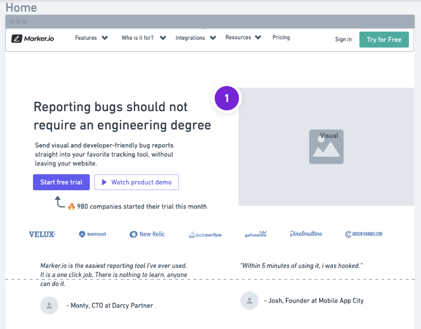
Webflow-specific tip: Components that are green mean that they can be reused on other pages, without having to remake them from scratch every time.
This is useful, but the trick is not to overdo it—so you can take some pages in another direction if necessary.
Every reusable component is connected, so if you change something on one page, it changes it across every page.
7. Get feedback on your website revamp
Now you’ve finished revamping your website, it’s time to get actual feedback from the rest of the team and/or your customers and clients.
The easiest way to do this is to install a simple feedback plugin, such as Marker.io.
With Marker.io, you can:
- Collect visual feedback with screenshots, annotations, and other notes without leaving your browser (from a staging or live site);
- Ensure all of that feedback goes straight into your PM tool of choice with 2-way sync;
- Assign tasks to designers, developers, and even your marketing team;
- Get all of the technical data you need when bugs are reported;
- See what a user was doing for the last 30 seconds (or more) before submitting feedback with the session replay tool.
Need a feedback tool for your website redesign?
Try Marker.io free for 15 days and make it easier for team members to give design feedback, report bugs, and automatically have this sync with your PM software.
Pricing: starts at $39/mo.
Website Redesign Frequently Asked Questions (FAQs)
How often should you redesign your website?
How often you do this depends on your objectives, time, budget, and whether it’s a project you need to spend time on.
Generally speaking, design trends and technology are evolving so fast that it’s worth doing this every 2-3 years.
However, you can take a more gradual approach. If a section of your website is looking outdated and bounce rates are high, with low conversion rates, then it’s worth updating your site just a few landing pages at a time.
What is the average cost of redesigning a website?
A website redesign shouldn’t be as expensive as building a new site from scratch.
However, the cost also depends on the features, project complexity, website size, functionality, whether it’s a custom design or template/framework, and technology.
If you’re keeping the site on the same technology/platform, then the cost shouldn’t be as high as moving it, also known as re-platforming.
For smaller websites, it shouldn’t cost more than $2000 to $3000 for template customization and basic development work.
For us, it would have cost $40.000 to get Webflow experts to design a custom template.
So, we saved money with a public template instead⏤and we’re happy with the result!
We hope you’ve found this checklist helpful.
Here’s a quick recap of the 7 steps to take when redesigning a website:
- Define your goals, branding, and messaging
- Conduct customer research
- Analyze the competition
- Choose the right software and CMS
- Prototype before building
- Create a 1-page style guide
- Get feedback on your website revamp
Got any more tips? Let us know on Twitter or via e-mail!
What should I do now?
Here are three ways you can continue your journey towards delivering bug-free websites:
Check out Marker.io and its features in action.
Read Next-Gen QA: How Companies Can Save Up To $125,000 A Year by adopting better bug reporting and resolution practices (no e-mail required).
Follow us on LinkedIn, YouTube, and X (Twitter) for bite-sized insights on all things QA testing, software development, bug resolution, and more.
Nathan Vander Heyden
Nathan is Head of Marketing at Marker.io. He used to work as a SEO consultant for various SaaS companies—today, he's all about helping Web Ops teams find more efficient ways to deliver bug-free websites.
Related blog posts

Get started now
Free 15-day trial • No credit card required • Cancel anytime