Improve collaboration with new Feedback Page
Improve collaboration with guests and developers with the new Feedback Page with attachments
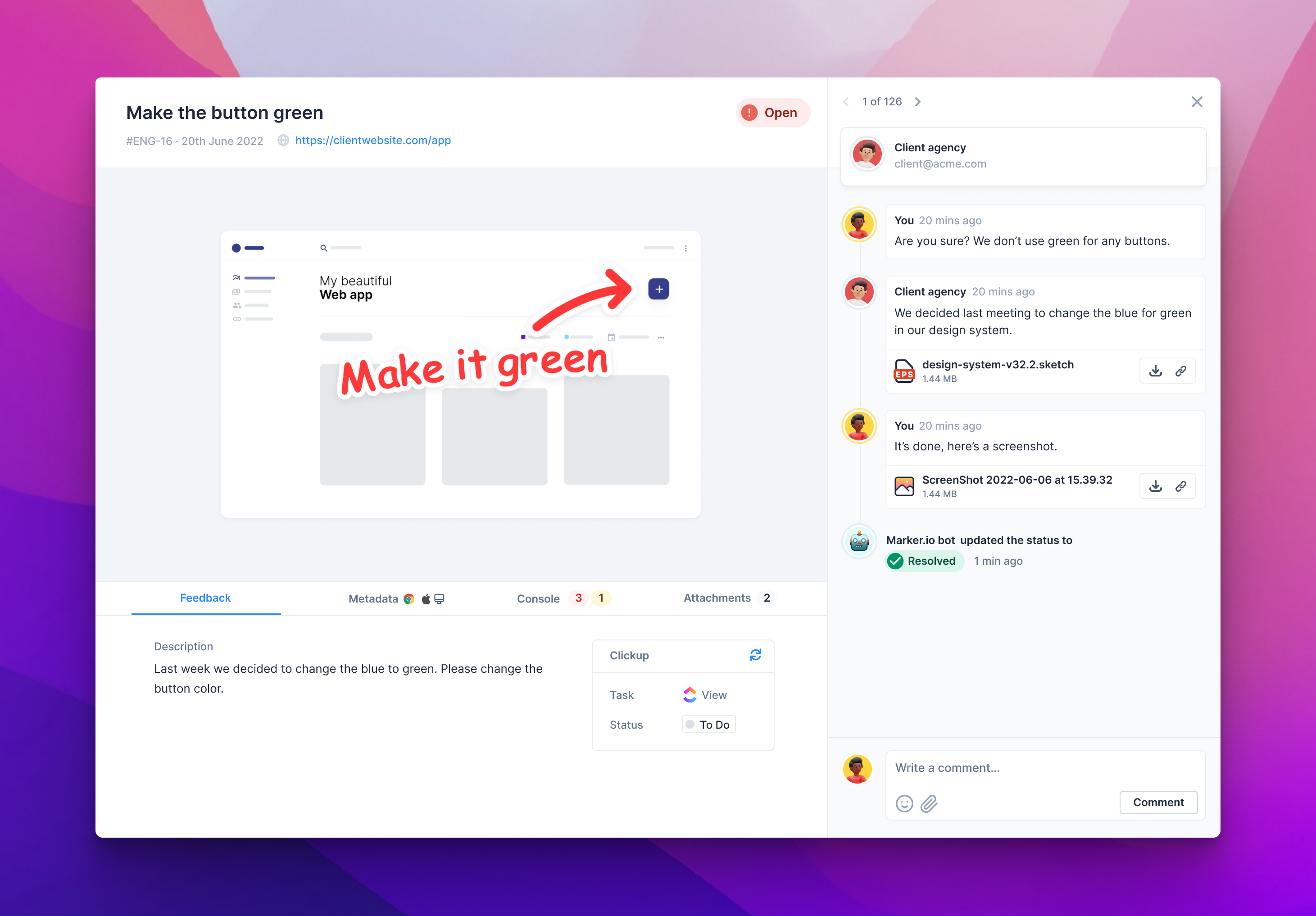
We’re happy to announce our new Feedback page design and comment attachments. The main goal was to make communication with guests and developers much smoother and more complete.
After talking with a few of our customers to better understand the needs and issues with our previous Feedback page, we came up with the issue page that you can experience live now.

New Feedback design
In a nutshell, information is easier to read and find.
Key changes:
- Centralized information on the left and comments on the right
- Metadata are now under tabs below the screenshot. These tabs will allow us to easily add more information in the future without breaking the layout of the page.
- 2-way Integration are way more clear
- For Jira users, we’re now showing the Jira Custom text fields that were sent during reporting.
- Console logs and metadata are available to developers even when not logged to Marker.io when they open the link from your PM tool.
Comment attachments
You can now attach files to your comments. A few examples of when it might be helpful to your team:
- Show the final result after a fix;
- Send the latest design version;
- Send the image to be replaced.
.png)
Key changes:
- Add attachments to your comments via your finder, drag & drop or paste an image in the comment box.
- Attachments are linked to the comment in the PM tool, and your email notifications
- Find all the attachments under the Attachments tab
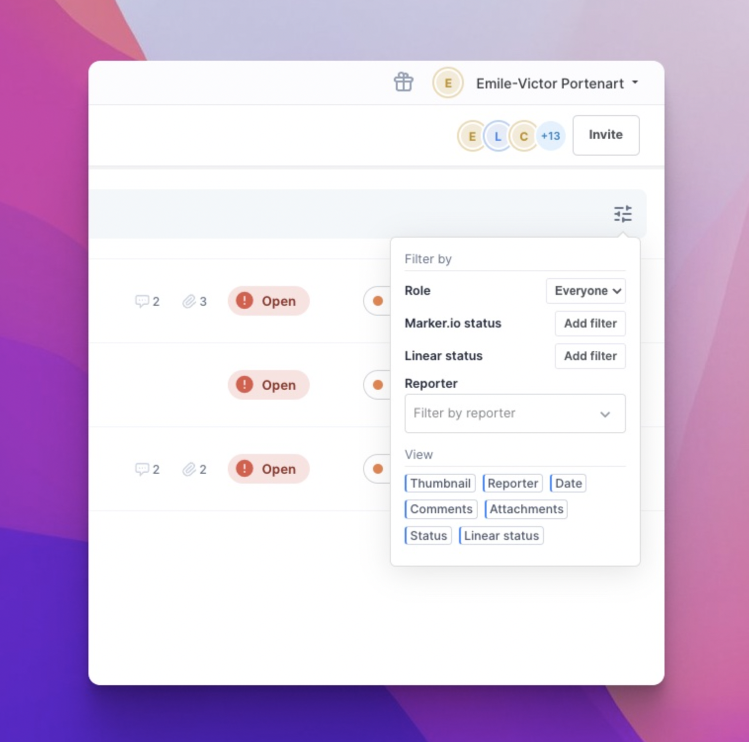
List of feedback
Same look, just much faster.
Key changes:
- The list is loading faster now, thanks to the work we did in the backend.
- We update the list in real-time, so there’s no need to refresh to see if new feedback has arrived.
- You can now scroll infinitely to load all feedback. No more 25 feedback per page limit.
- Hide and show feedback info to make the list of feedback your own.

That’s a wrap. We’d love to get your feedback on it! Reach out to us in the support if you have a suggestion.
What should I do now?
Here are three ways you can continue your journey towards delivering bug-free websites:
Check out Marker.io and its features in action.
Read Next-Gen QA: How Companies Can Save Up To $125,000 A Year by adopting better bug reporting and resolution practices (no e-mail required).
Follow us on LinkedIn, YouTube, and X (Twitter) for bite-sized insights on all things QA testing, software development, bug resolution, and more.
Get started now
Free 15-day trial • No credit card required • Cancel anytime


