New annotation tools & UX improvements
Getting a point across using screenshots and annotations should feel like a breeze.
Getting a point across using screenshots and annotations should feel like a breeze. That's why we've worked hard to build Marker.io's annotation tools editor from the ground up!
Below are some of the many improvements offered in our new annotation tools:
Text readability
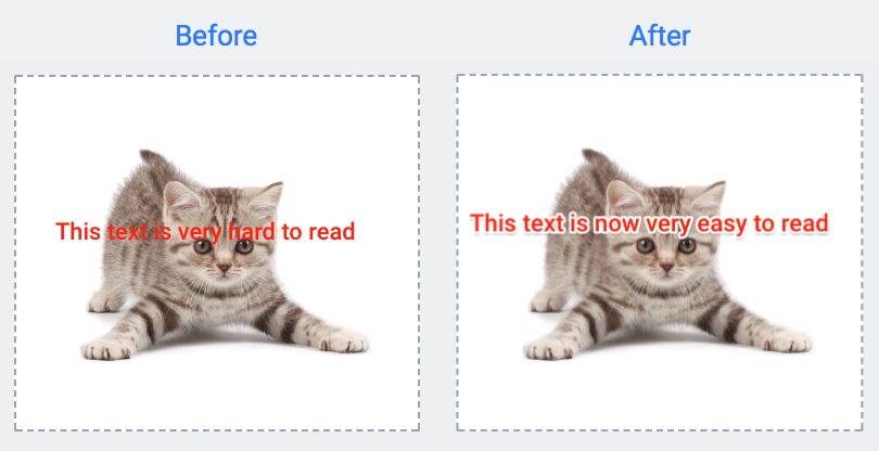
Keeping text readability when writing on top of color-rich images and elements has always been tricky. We added a white overlay and black shadow to text elements to avoid blending the text in with the screenshot.
Take a look at before and after the update.

Keyboard shortcuts
This was a highly requested feature: the ability to easily add, edit and remove annotation elements directly via your keyboard.

Here is the list of supported keystrokes for the annotation editor:
- Copy: ⌘+C (Mac) / CTRL+C (Windows)
- Paste: ⌘+P (Mac) / CTRL+P (Windows)
- Undo: ⌘+Z (Mac) / CTRL+Z (Windows)
- Redo: SHIFT+⌘+Z (Mac) / SHIFT+CTRL+Z (Windows)
- Selection of elements: Arrow (a), Text (t), Rectangle (r), Oval (o), Pen (p), Emojis (e) and Blur (b).
If you don't remember a specific keystroke, hover over the element and after a couple of seconds, a tooltip will appear explaining how to select each element with your keyboard.
Blur tool
When reporting visual feedback, you might have some confidential information that you'd rather hide. That's where our blur tool comes in. Now you can quickly draw over an area, immediately masking the confidential information and making it impossible to read.

And much more....
- New oval tool to draw circles
- Ability to edit color of existing elements
- Ability to upload images to existing screenshots
- Special characters are now supported, including: "áéíóúãõç" and Chinese and Japanese characters
- Plus, overall usability improvements
We hope these updated features will help speed up your workflow! ?
What should I do now?
Here are three ways you can continue your journey towards delivering bug-free websites:
Check out Marker.io and its features in action.
Read Next-Gen QA: How Companies Can Save Up To $125,000 A Year by adopting better bug reporting and resolution practices (no e-mail required).
Follow us on LinkedIn, YouTube, and X (Twitter) for bite-sized insights on all things QA testing, software development, bug resolution, and more.
Get started now
Free 15-day trial • No credit card required • Cancel anytime


