New features: Editor & Guest UX improvements
Are you finding the process of reporting website issues in your project management tool like Jira, Trello, Asana and other tools, overwhelming?
Are you finding the process of reporting website issues in your project management tool like Jira, Trello, Asana and other tools, overwhelming?
We’re excited to present numerous UX improvements that will make your feedback reporting experience a whole lot better. This update presents the next chapter in our continued efforts to make feedback reporting even faster and easier.
Let's dig in.
New: Editor UX revamp
Discover our complete revamp of the most important screen of Marker.io's app:
Our new editor 👀👇
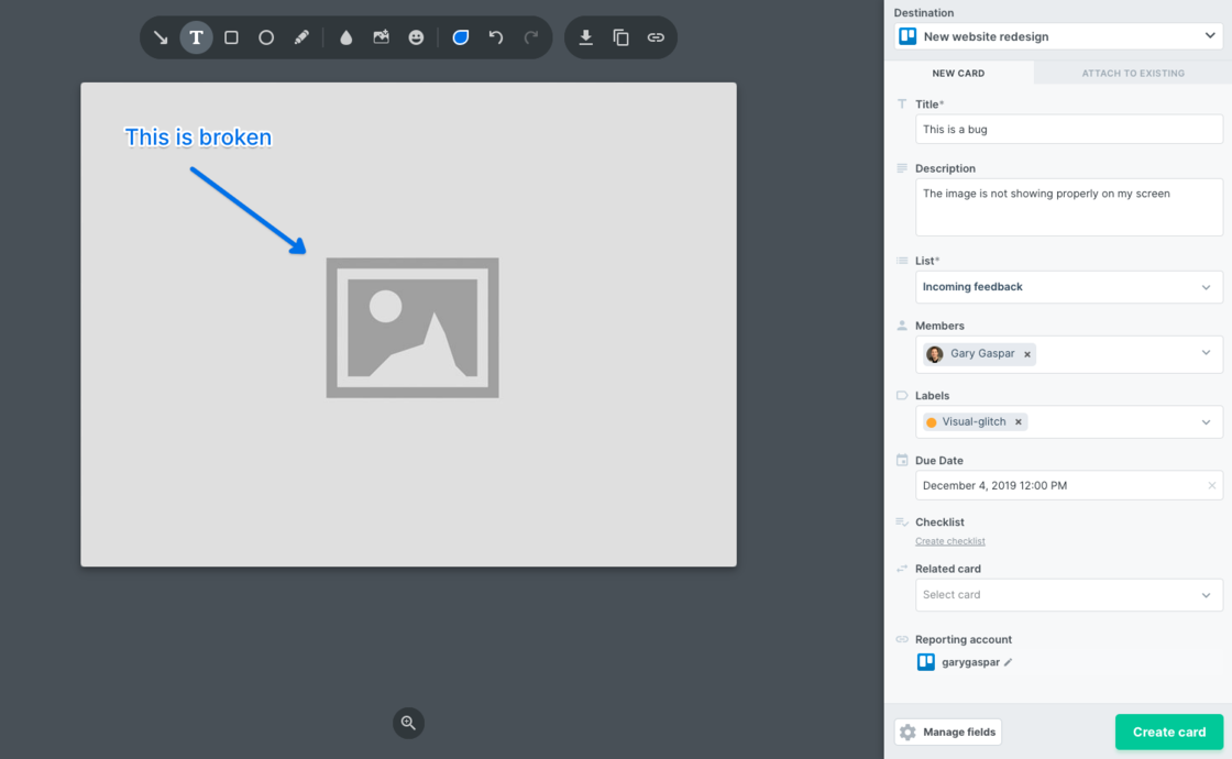
The visual changes are quite drastic, but the feedback we've received so far has been amazing! Here are a few of them:
1. Easier access to important fields 📖
In the past, the most important fields were hidden behind a modal. Now, all fields are directly accessible to all reporters, allowing your team to jump directly into getting things done.
2. Field "scan-ability" 🔎
Improved user-friendliness by giving each field individual icons. This makes it even easier for reporters to identify relevant fields quicker.
3. Deeper integrations 💪
Even more powerful integrations, displaying values like native user avatars, issue type icons, label, tag colors and much more.
4. Much, much more 🏆
We've made a ton of other tiny improvements that will further improve the efficiency and quality of your feedback. This update will also allow us to build new features faster, so expect a bunch of new updates soon 🙈. We hope you'll enjoy using it!
Great, how do I get started?
To use this new editor, you don't need to do anything. Simply use one of our extensions and capture a screenshot on any webpage.
New: Simplification of the guest view
When it comes to external project stakeholders, this is the feedback that we kept hearing:
I want my guests to have a simplified view of the fields.
I don't want my clients to see my list of assignees.
While team members need to report detailed issues, external contributors should have a simplified experience. We hear you 😎.
That's why we've drastically simplified the guest view by only showing descriptive fields as you can see below 👇
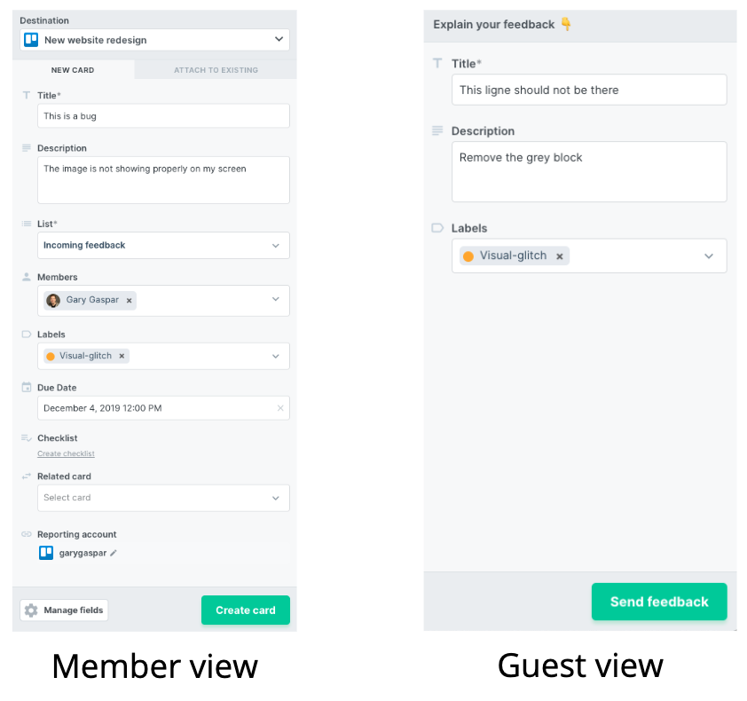
To activate this view, simply invite your external project contributors as guests inside one of your destinations.
Coming soon!
We are making amazing progress on our most requested product feature → the ability to embed Marker.io inside your website via a script.
This will allow admins to install Marker.io directly on websites and start collecting feedback into destinations instantly. If you're interested in this feature, we're looking for Beta testers.
Fill out this short survey to be part of the beta.
We'll be in touch soon!
What should I do now?
Here are three ways you can continue your journey towards delivering bug-free websites:
Check out Marker.io and its features in action.
Read Next-Gen QA: How Companies Can Save Up To $125,000 A Year by adopting better bug reporting and resolution practices (no e-mail required).
Follow us on LinkedIn, YouTube, and X (Twitter) for bite-sized insights on all things QA testing, software development, bug resolution, and more.
Get started now
Free 15-day trial • No credit card required • Cancel anytime


